Crafting a church website isn’t just about throwing together a few pages and hoping for the best. It’s about creating a digital home that reflects the heart and soul of your community. Think of it as the online extension of your church’s welcome mat. Now, let’s roll up our sleeves and get into how you can make your church website truly resonate with your congregation and newcomers alike.
1. Every Page Has a Story to Tell

Imagine each page of your website as a chapter in your church’s story. From the moment someone lands on your homepage, you guide them through a narrative. For instance, your homepage might be a warm welcome, your About page a deep dive into your church’s journey, and your events page an invitation to join the adventure. Make sure every page knows its role in the story you’re telling.
2. Main Navigation: Your Digital Roadmap
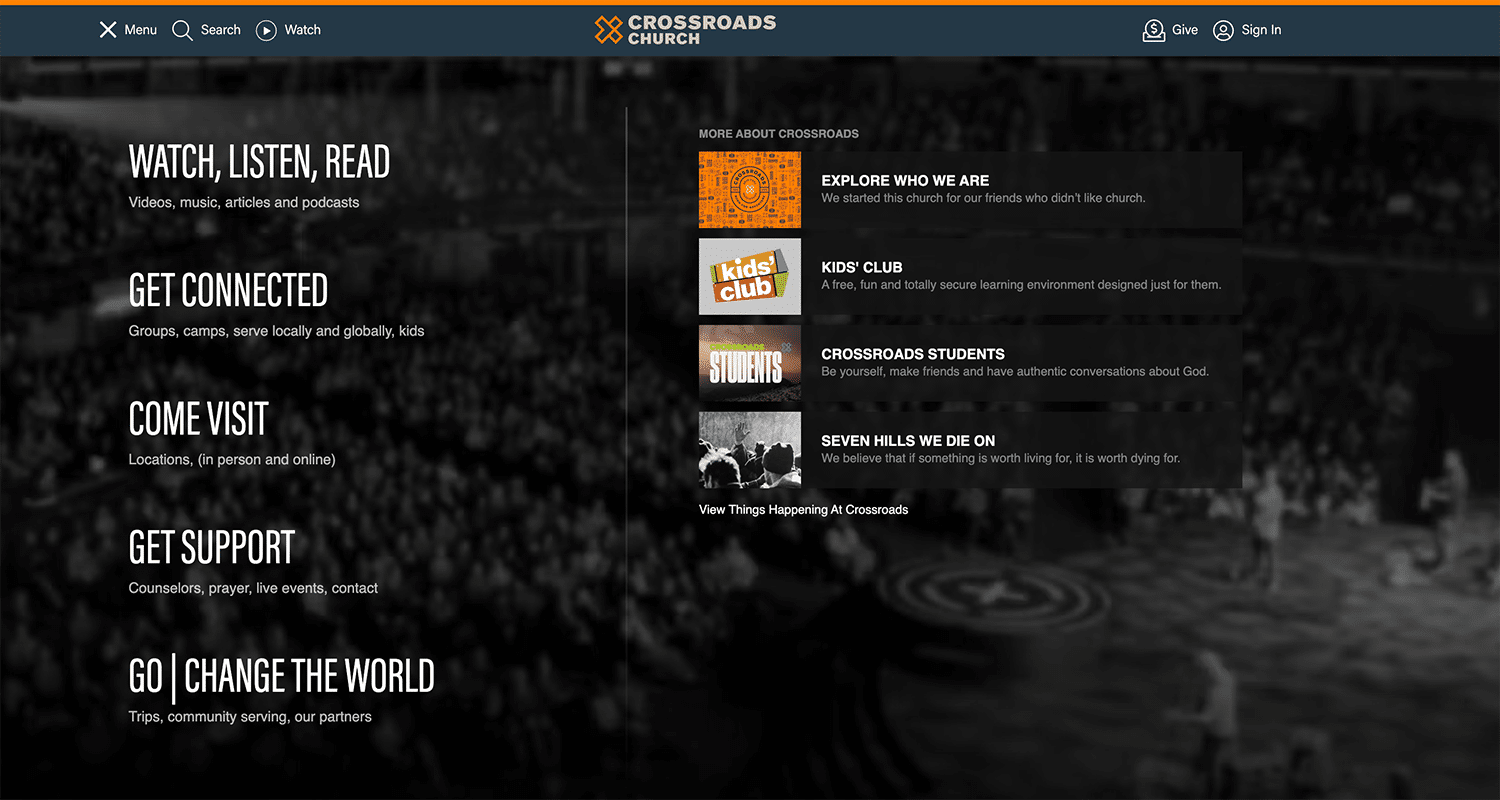
Ever been lost in a new city? Not fun, right? The same goes for your website. Your navigation should be the GPS that guides visitors through your site. Use clear, jargon-free language that anyone, from tech-savvy teens to your grandma, can understand. Think of it as the friendly signpost pointing the way.
3. Next Steps: Make Them Irresistible
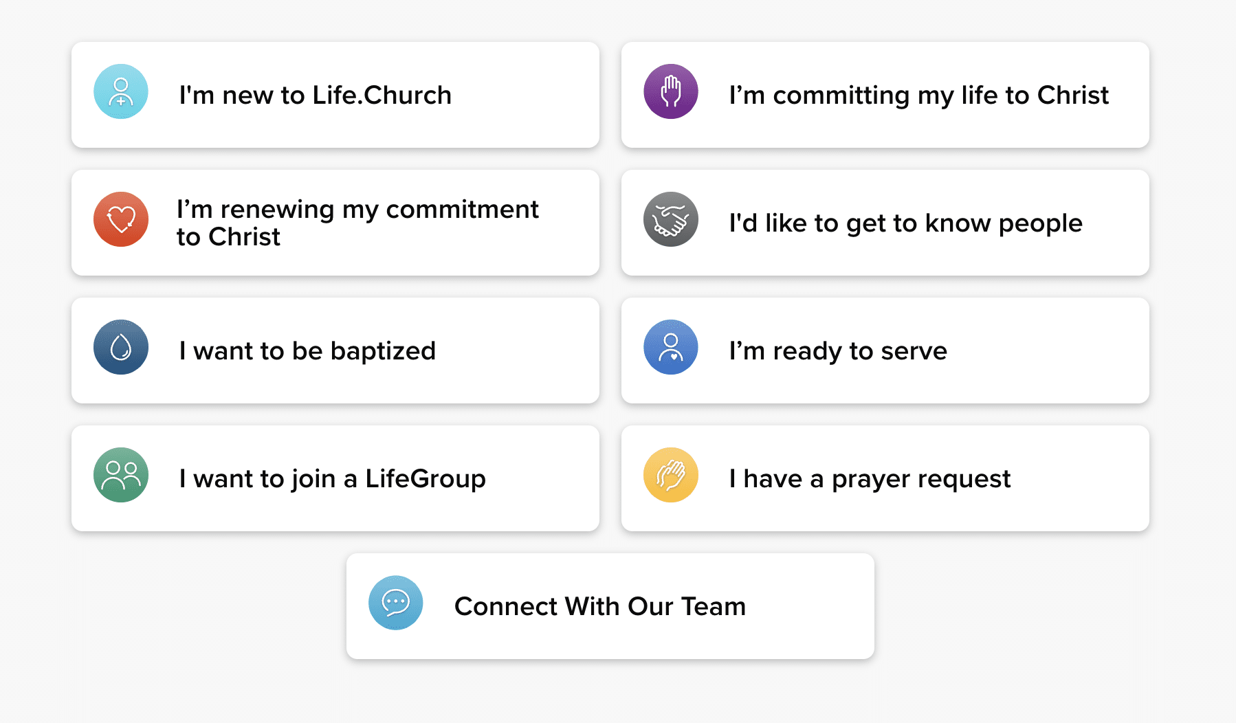
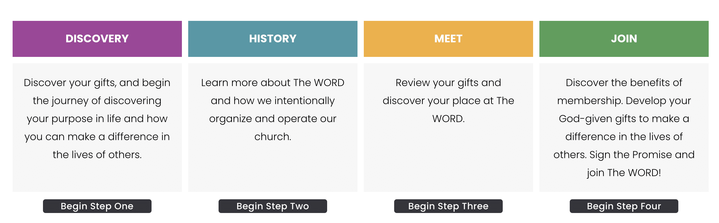
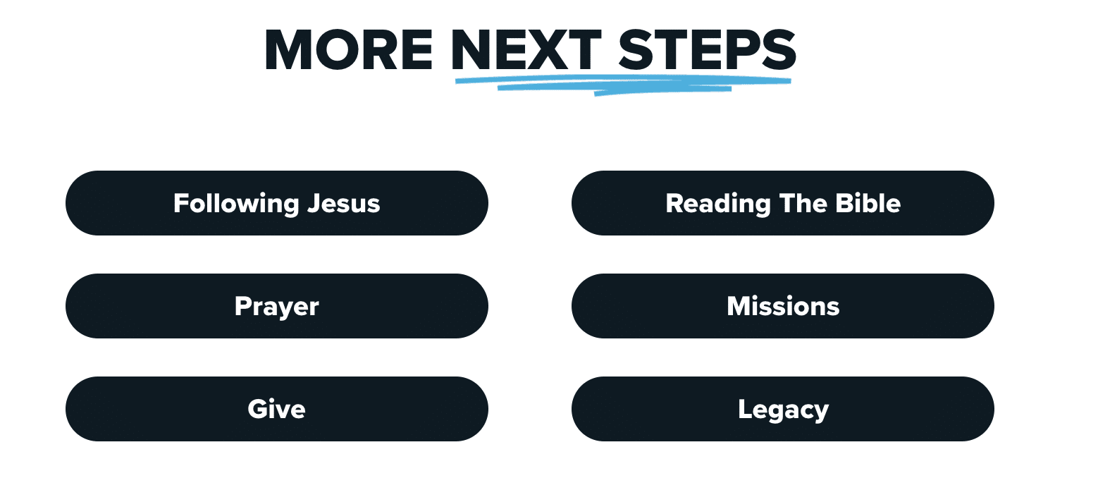
Your website isn’t just a brochure; it’s a journey. Each page should gently nudge visitors towards taking action, whether attending a service, joining a group, or just learning more about your faith. Make these next steps as inviting and obvious as possible, like a friend extending a hand to guide you.
4. Speak From the Heart
When writing your content, forget the formalities. Write as if you’re having a coffee with someone you care about. Use humor, warmth, and personality to break the ice and make visitors feel right at home. Remember, it counts not just what you say but how you say it.
5. Design for the Skimmer (No one reads these days)

Let’s face it; we’re all a little impatient online. Make your content easy to skim by breaking it up with headings, bullet points, and images. It’s like giving your visitors a map of the treasure trove of information your site holds, allowing them to quickly find the gold nuggets.
6. Typography: The Personality of Your Site

Fonts are like the clothes your website wears. Choose fonts that reflect the personality of your church. A modern, clean font might convey a fresh, vibrant community, while a classic serif font could speak to tradition and history. Just remember to dress appropriately—no more than two fonts, please!
7. Color: Painting Your Online Personality

Colors can evoke emotions, set a mood, and even influence decisions. Choose a palette that reflects your church’s spirit and use it consistently across your site. Let your colors tell a story, whether it’s the tranquility of earth tones or the joy of bright pastels.
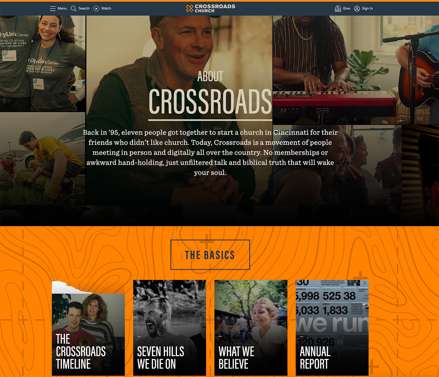
8. Images: Show, Don’t Tell

A picture is worth a thousand words, right? Use real, heartfelt images of your community to show what words can’t. This visual storytelling can connect deeper, showing the life and love within your church.
9. Video: Says More Than Million Images
Incorporating videos into your church website is a game-changer because it transforms how visitors connect with your community before they even step through the doors. Videos can uniquely convey emotion, atmosphere, and personality in a way that text and photos alone cannot.
They allow potential visitors to experience the warmth of your welcome, the vibrancy of your worship, and the depth of your teachings, creating an instant emotional connection that words might struggle to achieve. By showcasing real-life moments, testimonials, and messages through video, you’re not just sharing information; you’re extending a personal invitation into the life of your church, making every visitor feel seen, understood, and valued from their first click.
10. Declutter: Less is More
Websites can become cluttered in the quest to share everything. Keep it simple. If something doesn’t serve a clear purpose, it might be time to let it go. A clean, uncluttered website is like fresh air for your visitors.
If you ever doubt whether something should or shouldn’t be there, just remove it. Less is more.
11. Podcasts: Future is Now
Starting a podcast can be a game-changer for a church. It’s a cool way to share sermons and updates far and wide, reaching folks who can’t make it on Sundays or are just curious about what’s happening. Plus, it lets the church connect with people on the go, anytime, anywhere, making it super easy for everyone to keep in touch with their spiritual community. It’s like having a little bit of church in your pocket!
12. The ‘Junk Drawer’: Hide but Don’t Forget
Even with decluttering, there are things you need but don’t need to showcase. That’s where your digital “junk drawer” comes in—a place in your footer for all those miscellaneous links. It’s there when you need it, but not in the way of your website’s flow. This includes pages like Terms & Conditions, Privacy Policy, and others that must be there but can be hidden away from sight.
Do you need a simple website just like we described? Please get in touch with us for more details.
Wondering how much will it cost? Here is a cost breakdown for a church website.
Wrapping It Up
Remember, your church website is more than just a collection of pages—it’s the beginning of a conversation, an invitation to join a community, and a place to find belonging. With these tips, I hope you feel equipped to create a space that feels like home for anyone visiting.
And hey, if you’ve got a tip or a success story from your website journey, I’m all ears. Sharing is caring, after all. Happy building, and may your website be as welcoming and vibrant as your church!
More Church Website Resources
- 50 Best Church Website Designs — See what the best church websites look like in 2026.
- Church Website Design Trends — 10 trends that actually matter for modern churches.
- Church Website SEO Guide — Help more people find your church online.
- Essential Church Website Features — Make sure your site has everything it needs.
Leave a Reply