When you’re building a church website, it’s easy to get overwhelmed by all the things you could include. Sermon archives, event calendars, live streaming, prayer request forms, small group finders, member portals — the list goes on forever.
But here’s what we’ve learned from reviewing hundreds of church websites: the ones that actually help churches grow aren’t the most feature-rich. They’re the ones that nail the basics and make it incredibly easy for new visitors to take the next step.
This guide organizes church website features into three tiers — must-haves, important additions, and nice-to-haves — so you know exactly what to build first and what can wait. We’ve also included a priority table by church size at the end, because a church of 50 has very different needs than a church of 5,000.
Table of Contents
- Must-have features (launch with these)
- Important features to add after launch
- Nice-to-have features
- Feature priority by church size
- FAQ
Must-Have Features: Launch With These
These are the non-negotiable features every church website needs from day one. If your site doesn’t have all six of these, that’s your first priority — before adding anything else.
1. Service Times and Location (Visible Immediately)
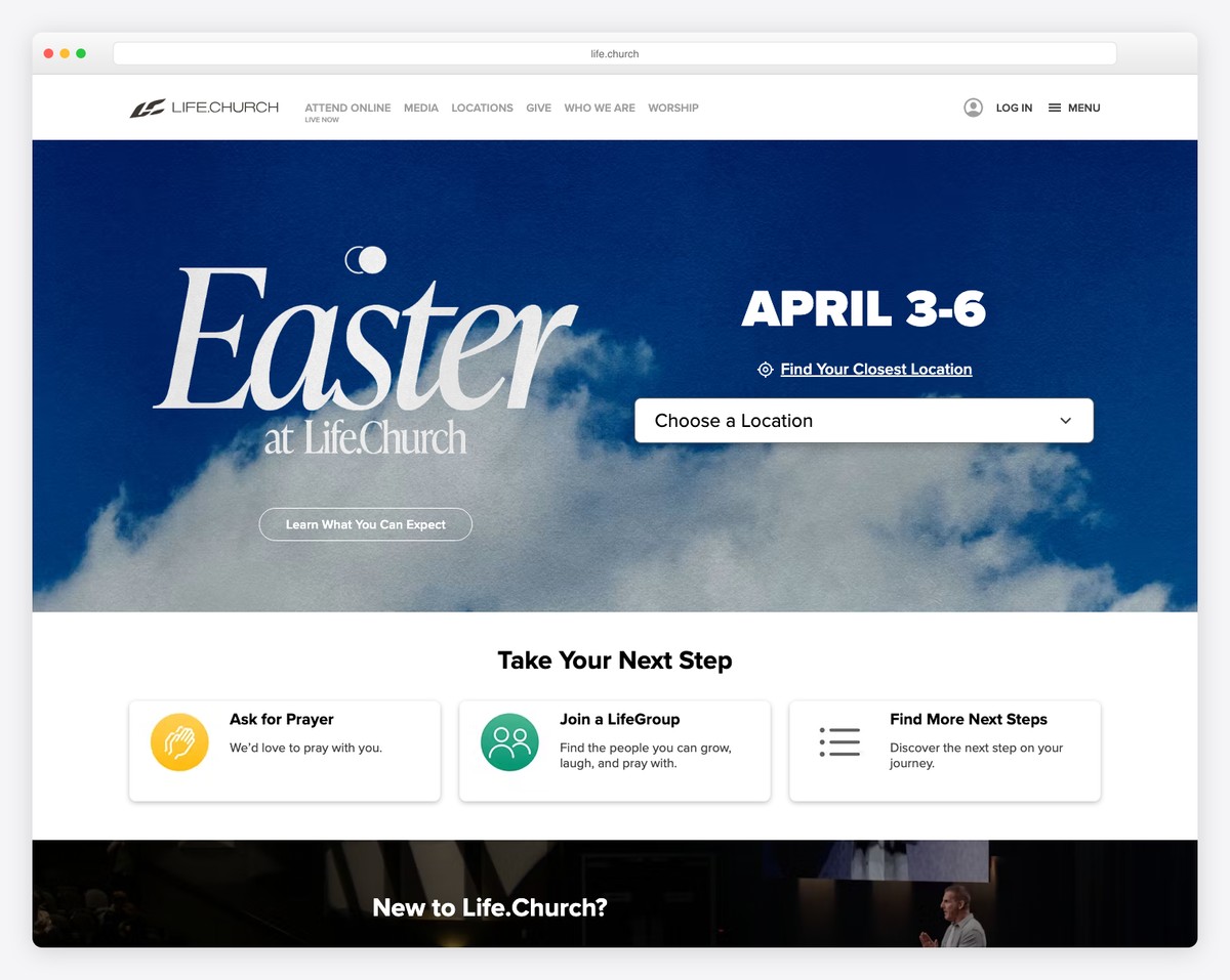
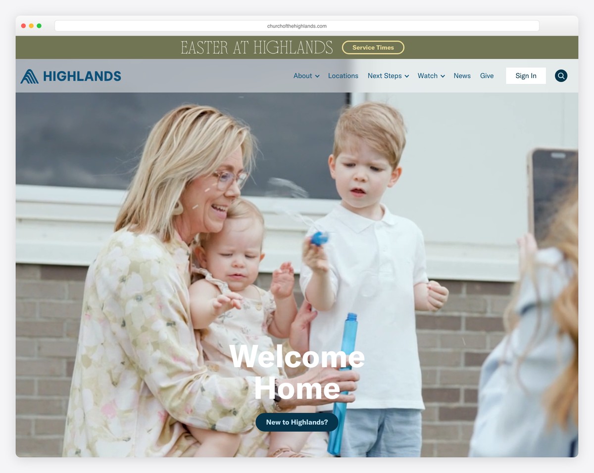
This is the #1 reason people visit your website. They want to know when and where. If a visitor has to click around or scroll past a giant hero image to find this information, you’ve already lost them.
Best practice: Display service times and your address on the homepage above the fold — meaning visible without scrolling. Many of the best church websites put this right in the hero section, either overlaid on the main image or in a clean bar just below it.
Include all service times (Sunday morning, Sunday evening, Wednesday night), your full street address, and an embedded Google Map or a link to directions. If you have multiple campuses, list them all with clear labels.
2. Plan Your Visit Page
This is the most important page on your entire website — more important than your homepage. The Plan Your Visit page is where a curious website visitor decides whether to actually walk through your doors on Sunday. For a full walkthrough — 10 real examples, a step-by-step build, and a copy-and-paste template — see our guide to building a church Plan Your Visit page.
A great Plan Your Visit page answers every question a first-time visitor might have:
- What should I wear? (“Come as you are — you’ll see everything from jeans to Sunday best.”)
- How long is the service? (“About 75 minutes — worship music followed by a message.”)
- Where do I park? Include a photo of your building exterior and parking lot entrance.
- What about my kids? Age groups, check-in process, when to arrive, what the rooms look like.
- What’s the worship style? Contemporary, traditional, or blended — set expectations honestly.
- Will I be singled out? Reassure visitors they won’t be asked to stand up or be put on the spot.
Use real photos, not stock images. Show your actual lobby, your actual kids’ space, your actual worship team. People want to see what they’re walking into. For a detailed walkthrough, check our guide on essential church website pages.
3. Online Giving
Online giving isn’t optional anymore. In 2026, the majority of tithes and offerings at most churches come through digital channels — not the offering plate. If you don’t have online giving set up, you’re leaving money on the table (literally).
The giving experience needs to be:
- Fast: Three clicks or fewer to complete a gift. Name, amount, pay.
- Mobile-friendly: Most online gifts happen on phones.
- Accessible from every page: A “Give” button in your main navigation.
- Recurring-friendly: Make it easy to set up recurring gifts — this dramatically increases giving consistency.
Popular options include Tithe.ly (2.9% + $0.30 per transaction, church-specific), Pushpay, Planning Center Giving, and Subsplash Giving. We have a detailed comparison in our online giving guide.
4. Mobile-Responsive Design
Over 70% of your website visitors are on phones. If your site doesn’t look great and function perfectly on a 6-inch screen, most of your audience is having a bad experience.
Mobile-responsive means your site automatically adjusts its layout based on screen size. All modern church website builders — Squarespace, WordPress, Tithe.ly, Wix — build responsive sites by default. But “responsive by default” doesn’t mean it looks good by default. A strong mobile site is also the reason most churches don’t need a separate app — see church app vs church website. Always check:
- Navigation is easy to use on mobile (hamburger menu that works smoothly)
- Text is readable without zooming
- Buttons are large enough to tap with a thumb
- Images don’t slow down page load
- Giving and contact forms work on mobile
Test your site on your own phone regularly. Better yet, hand your phone to someone who’s never seen your site and watch them try to find service times. You’ll learn more in 60 seconds than hours of design meetings.
5. About Page and Statement of Beliefs
After checking service times, the About page is typically the second or third most-visited page on a church website. Visitors want to know: Who are you? What do you believe? Who leads this church?
Your About page should include:
- Your church’s story — when you started, why you exist, what you’re about. Keep it human and honest.
- Statement of beliefs — your core theological positions. This can be a separate page or a section within About. Don’t hide it — people want to know your denomination and theological stance before visiting.
- Denomination/affiliation — clearly stated, not buried in fine print.
- Pastor or lead team photos — real photos with short bios. Visitors want to see who’ll be speaking on Sunday.
Write this in first person (“We believe…”) and keep the tone warm. Avoid insider language and denominational jargon that unchurched visitors won’t understand.
6. Contact Information
This seems obvious, but a surprising number of church websites make it hard to find basic contact info. Your phone number, email, and physical address should be:
- In your website footer (visible on every page)
- On a dedicated Contact page
- Clickable on mobile (tap-to-call for phone, tap-to-email for email)
Include a simple contact form for people who prefer not to call. Keep it short: name, email, message. Don’t ask for their life story — you just need enough to start a conversation. To turn first-time guests into return visitors specifically, add a short digital connection card — here’s exactly what to put on it and the follow-up that works.
Important Features to Add After Launch
Once your six must-haves are solid, these are the features to add next. They deepen engagement and serve your existing congregation, but they shouldn’t delay your launch.
Sermon Archive
Your sermon archive is typically the second most-visited section of your website (after the homepage). People use it to re-listen to sermons they heard on Sunday, catch up on weeks they missed, and share specific messages with friends.
The best sermon archives organize content by series (not just by date), feature the current series prominently, and include filtering by speaker, topic, or scripture. Think Netflix for sermons — browsable and visual with series artwork.
We have a complete guide on how to set up your sermon archive, including platform-specific instructions and media hosting comparisons.
Events Calendar
An events calendar keeps your congregation informed and helps visitors see that your church is active and alive. But keep it curated — only public-facing events that visitors and members need to know about. Internal staff meetings and setup team schedules don’t belong here.
For more details on implementation, see our church event calendar guide.
Staff/Leadership Page
A dedicated staff page with professional photos and short bios helps visitors put faces to names. Include your lead pastor, associate pastors, worship leader, kids’ director, and key staff. For each person, include their role, a brief bio (2-3 sentences), and optionally their email.
Keep the bios personal and approachable. “Pastor Mike loves bad puns and coaching his daughter’s soccer team” is more relatable than a paragraph about seminary credentials.
Small Groups Finder
If your church has small groups, community groups, or life groups, make them easy to find on your website. A simple list with day/time, location (or “online”), topic, and a contact person works for most churches. Larger churches may want filtering by day of week, location, or life stage.
The goal is to lower the barrier to joining. Someone browsing your site at 10 PM shouldn’t have to wait until Sunday to ask someone about groups — they should be able to find one and sign up right there.
Nice-to-Have Features
These features can significantly enhance your church’s online presence, but they require more resources to maintain. Add them when you have the bandwidth to do them well.
Live Streaming
Live streaming exploded during 2020 and has remained a fixture at many churches. It serves homebound members, travelers, and people “church shopping” who want to watch before they visit. The simplest approach is embedding a YouTube Live stream on a dedicated page of your website.
But be aware: live streaming done poorly (bad audio, shaky camera, no one monitoring chat) is worse than not streaming at all. Only add this when you can do it consistently and with decent quality. Read our live streaming guide for equipment recommendations and setup instructions.
Prayer Request Form
An online prayer request form gives people a way to ask for prayer without approaching someone in person — which can feel intimidating, especially for visitors. Keep the form simple: name (optional), email (optional), prayer request, and whether they’d like the request to be shared with the prayer team or kept confidential.
The critical part isn’t the form — it’s the follow-up. Someone needs to actually read and respond to every request within 24-48 hours. If you can’t commit to that, don’t add the form. Our prayer request page guide covers best practices.
Member Portal
A member portal provides a login area for your congregation to access things like online directories, giving statements, group sign-ups, and volunteer scheduling. Platforms like Planning Center, Tithe.ly, and Subsplash offer these built-in.
This is valuable for larger churches but adds complexity. Don’t let a member portal delay your public-facing website. For more on this topic, see our member portal guide.
Blog
A church blog can be a powerful tool for SEO and community engagement — but only if you can publish consistently. A blog with three posts from 2023 looks worse than no blog at all. If you’re going to blog, commit to at least two posts per month: sermon recaps, devotionals, community stories, or seasonal content.
Podcast
If you’re already recording sermons, turning them into a podcast is relatively easy and extends your reach to people who prefer listening on Spotify or Apple Podcasts during their commute. Services like Buzzsprout and Anchor make podcast distribution simple and affordable.
Feature Priority by Church Size
Not every church needs every feature. Here’s a practical guide based on church size:
| Feature | Under 100 | 100-500 | 500+ |
|---|---|---|---|
| Service times & location | Essential | Essential | Essential |
| Plan Your Visit page | Essential | Essential | Essential |
| Online giving | Essential | Essential | Essential |
| Mobile-responsive design | Essential | Essential | Essential |
| About & beliefs page | Essential | Essential | Essential |
| Contact info | Essential | Essential | Essential |
| Sermon archive | Nice to have | Important | Essential |
| Events calendar | Nice to have | Important | Essential |
| Staff page | Nice to have | Important | Essential |
| Small groups finder | Not needed | Important | Essential |
| Live streaming | Not needed | Nice to have | Important |
| Prayer requests | Nice to have | Nice to have | Important |
| Member portal | Not needed | Nice to have | Important |
| Blog | Not needed | Nice to have | Nice to have |
| Podcast | Not needed | Nice to have | Nice to have |
| Multi-site campus pages | Not needed | Not needed | Essential (if multi-site) |
The pattern is clear: small churches should focus on the six must-haves and not worry about advanced features. Medium churches should add the “Important” tier over their first year. Large churches need most features from the start, but can phase in the nice-to-haves.
No matter your size, start with the essentials and add features only when you can maintain them well. A half-built feature (an events calendar with nothing listed, a blog with one post) is worse than no feature at all. For help choosing a platform that scales with your needs, check our church website builder comparison.
Frequently Asked Questions
What’s the most important feature for a brand-new church website?
The Plan Your Visit page. It’s the page that converts website visitors into in-person visitors. Your homepage might get more traffic, but your Plan Your Visit page drives actual attendance. Make it thorough, warm, and full of real photos. See our essential pages guide for a template.
Do we need a sermon archive if we’re a small church?
Not immediately. If you’re under 100 people, focus on the six must-haves first. When you’re ready to add sermons, start simple — a YouTube channel embedded on a single page. You can get fancy with series artwork and filtering later.
Should we add features ourselves or hire someone?
The six must-haves are achievable on any modern church website builder without hiring anyone. Platforms like Squarespace and Tithe.ly make these features drag-and-drop. For advanced features like custom member portals or complex integrations, you might need a developer — but most churches never reach that point.
How many pages should a church website have?
For a church under 200 people, 5-7 pages is plenty: Home, About, Plan Your Visit, Sermons, Give, Contact, and maybe Events. Don’t create pages you can’t maintain. A 50-page website with outdated content is worse than a 5-page website that’s current and polished. Quality over quantity, always.
What features do visitors care about most?
Based on analytics across hundreds of church websites, visitors look at (in order): service times and location, Plan Your Visit page, About/beliefs page, sermon archive (to preview the teaching), and staff page. Everything else is primarily used by existing members, not visitors. Build for visitors first, members second.
More church website guides
- How to build a church small groups page that fills groups
- The church contact page: what to include + examples
- How to embed your YouTube live stream on your church website
- How to add a Spanish version to your church website
Leave a Reply