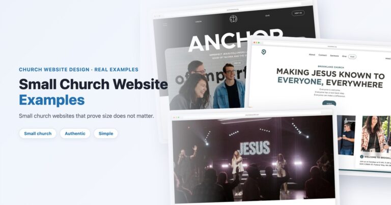
Church Website Examples
Church website design has changed more in the last two years than in the previous decade. The pandemic forced churches online, and visitors’ expectations jumped to match the rest of the internet. A church website that looked fine in 2021 now feels dated — and “dated” means “untrustworthy” to the 83% of potential visitors who check your website before ever walking through your doors.
But here’s the good news: you don’t need to chase every design trend. Most trends are fluff. This guide covers only the 10 that are actually shaping how effective church websites look and function in 2026 — the ones that make a measurable difference in visitor engagement and conversions.
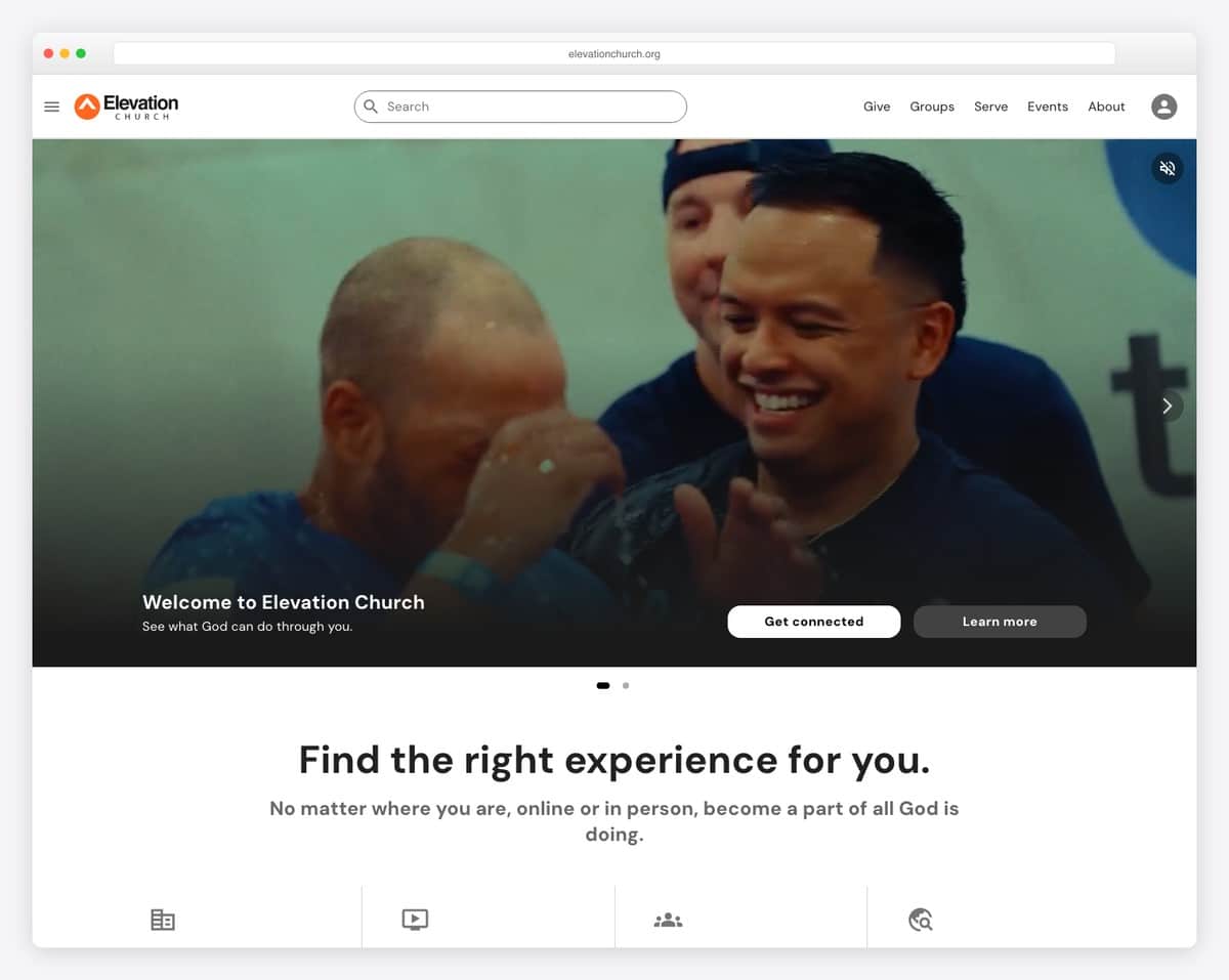
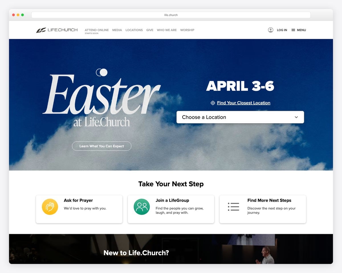
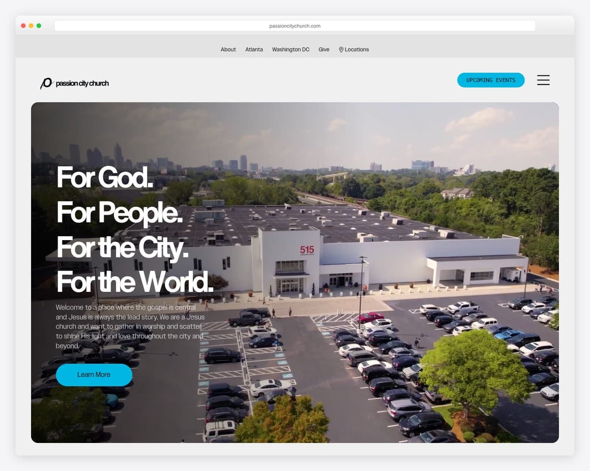
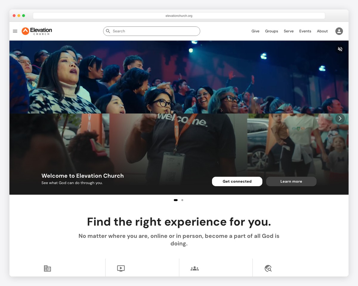
Trends are easier to grasp when you can see them. Here are real church websites putting these ideas into practice — bold typography, authentic photography, Netflix-style sermon browsing, and giving woven throughout. Steal what fits your ministry:
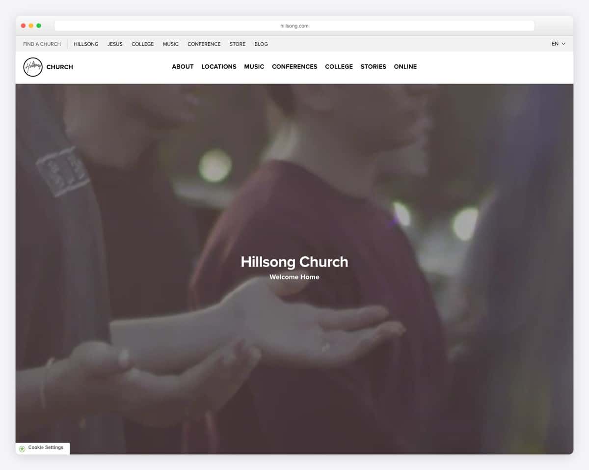
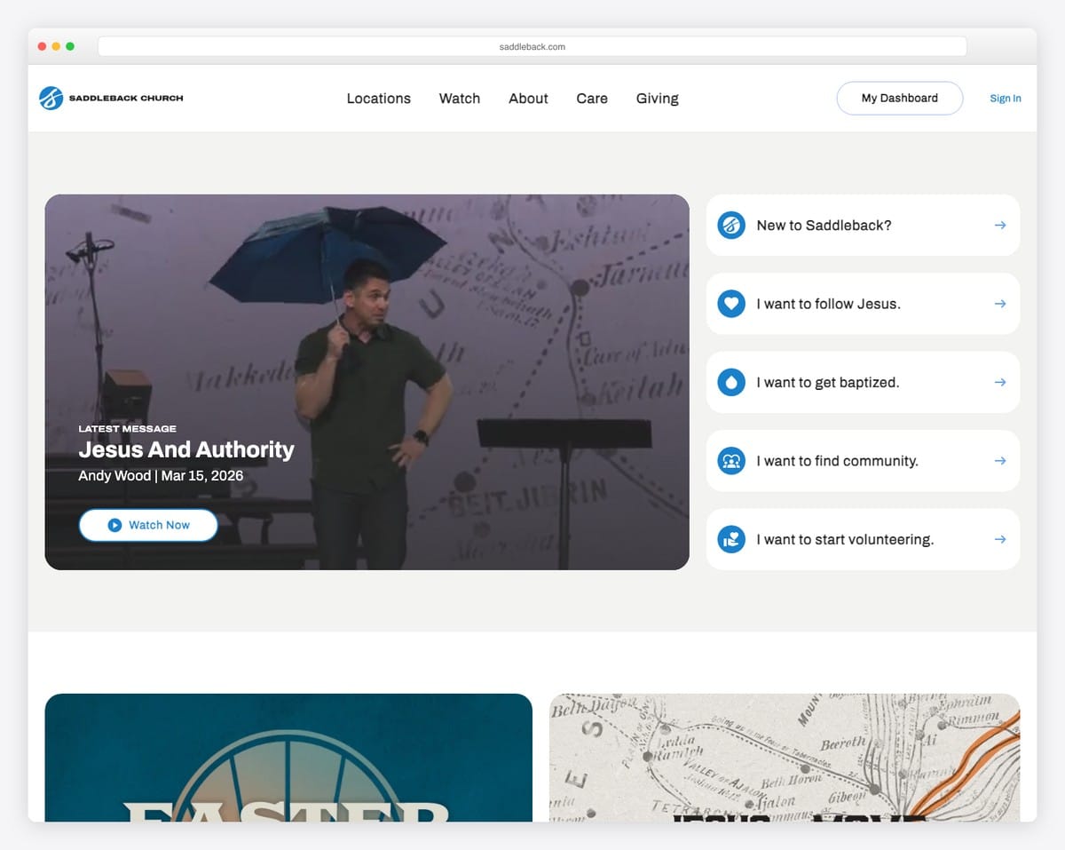
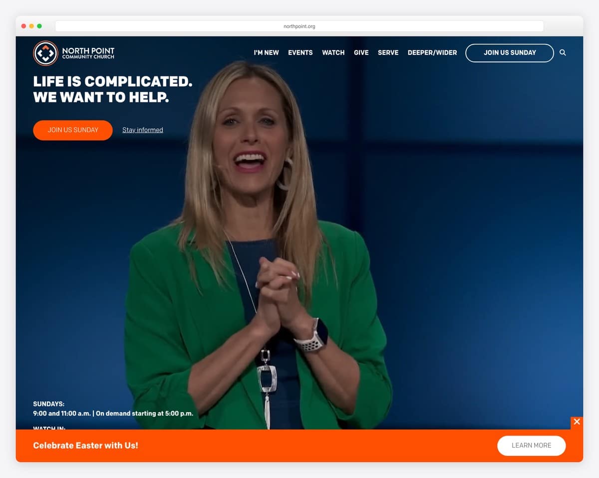
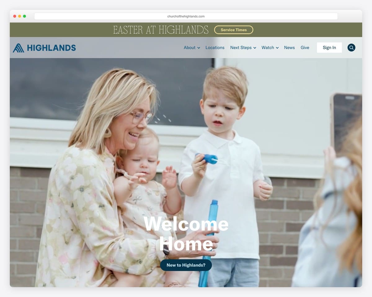
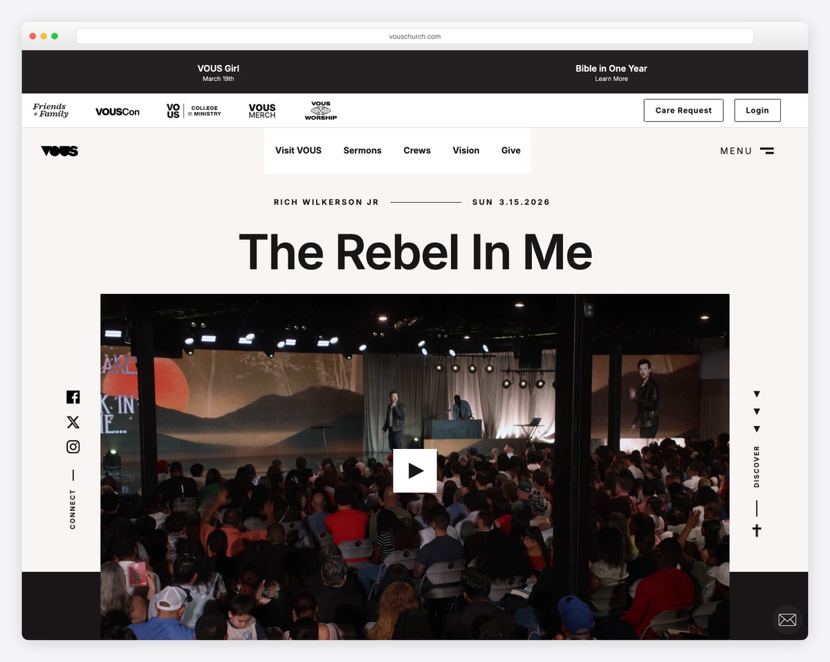
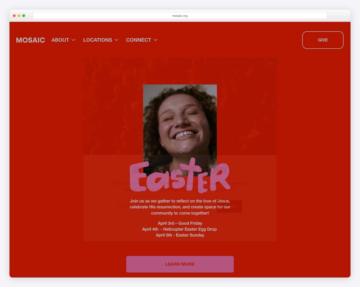
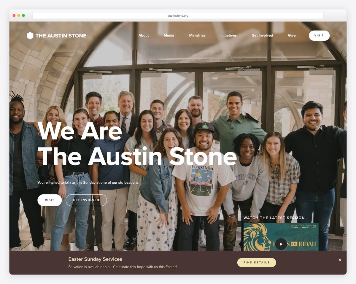
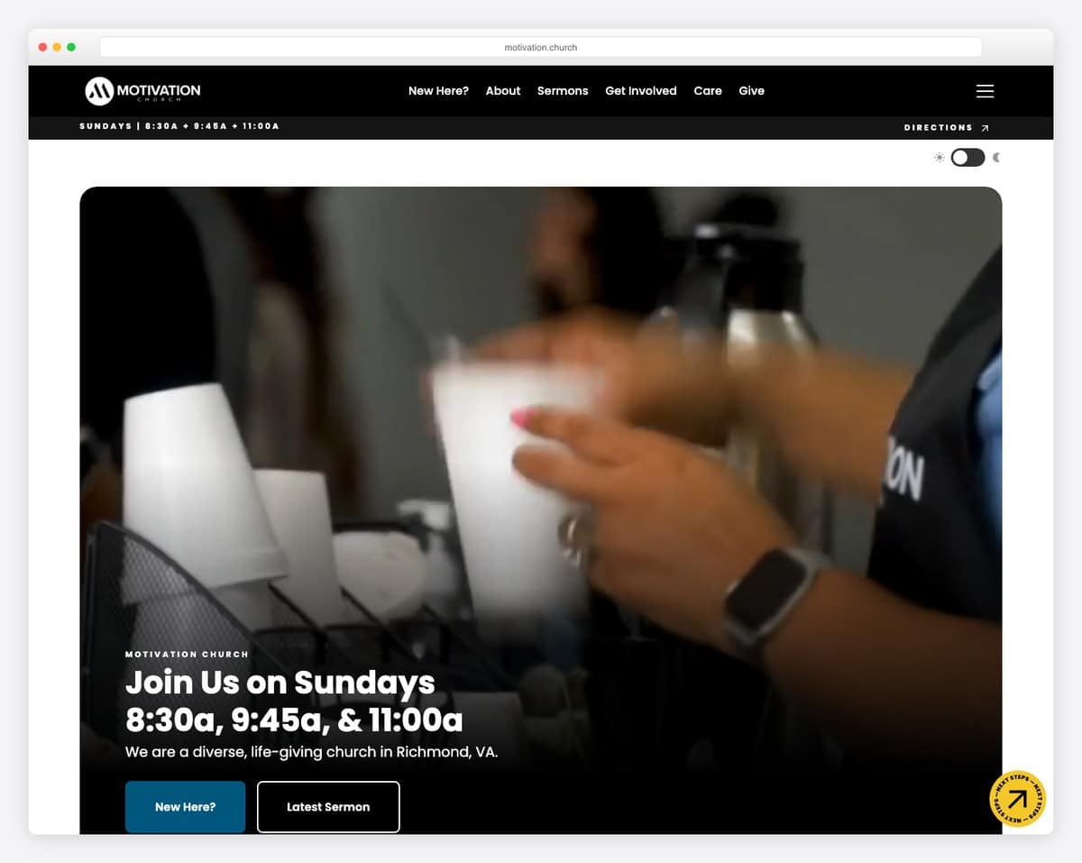
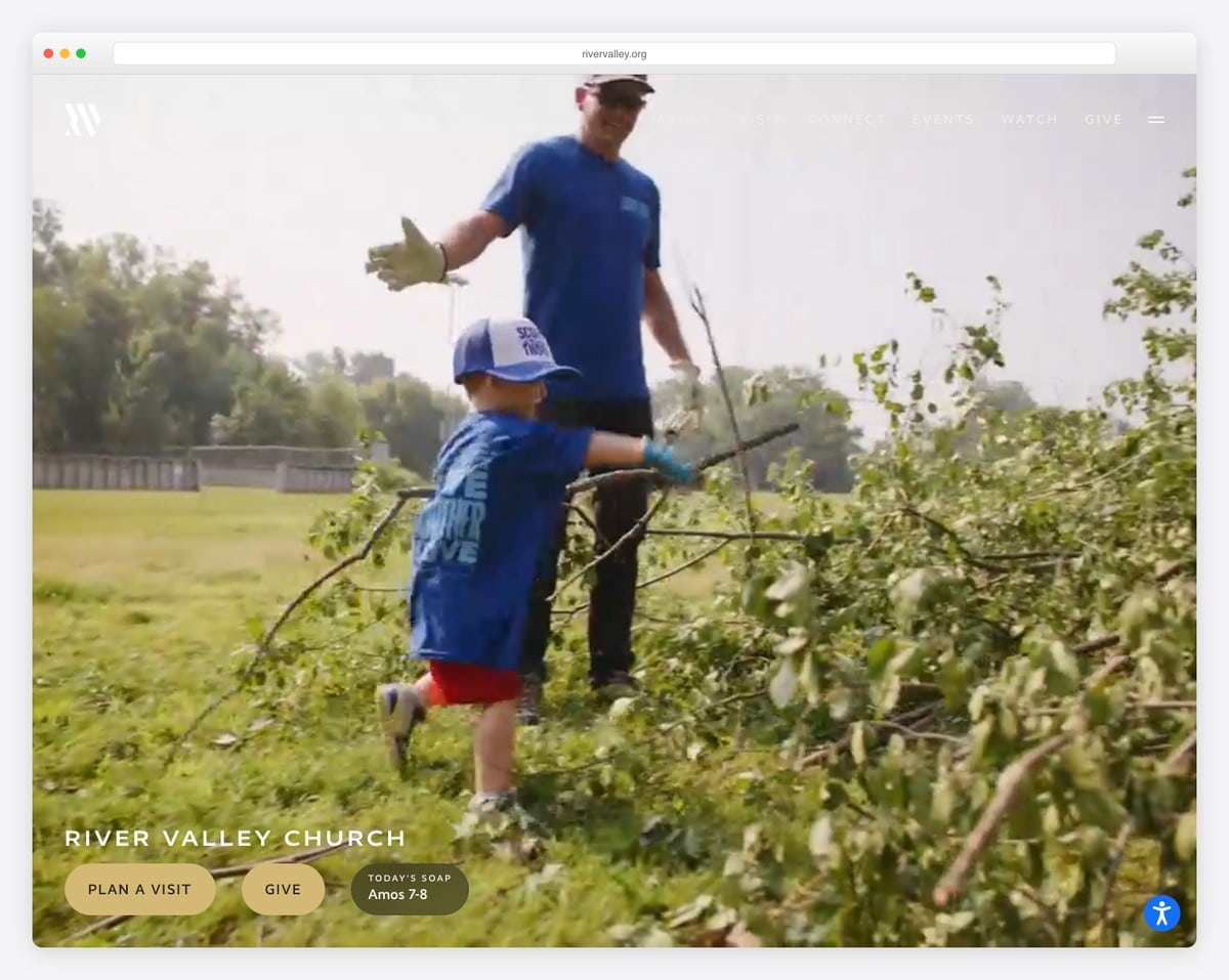
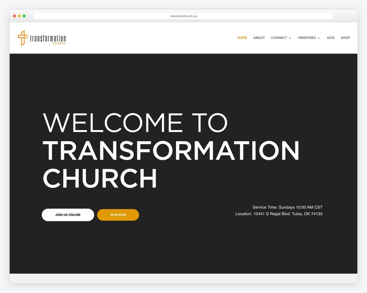
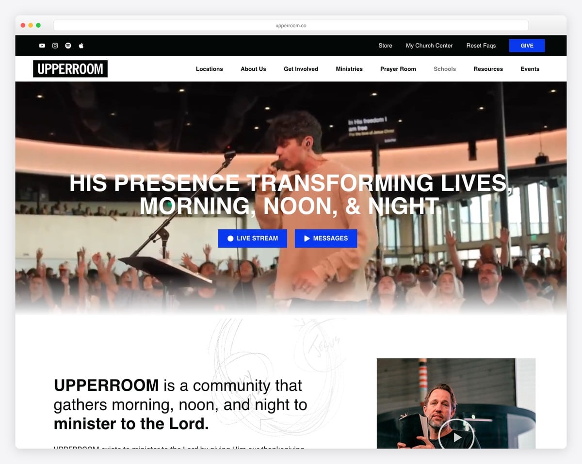
Want the full breakdown? We analyze 50 of these in our best church website designs roundup, with the platform and standout feature for each.
This isn’t really a design trend — it’s the reality that drives all the other trends. Eighty-three percent of first-time church visitors check the website before showing up in person. For many people, your website is their first visit.
That changes everything about how you should design your site. Your homepage isn’t a brochure for existing members. It’s a welcome mat for strangers. Every design decision should answer the question: “If this is someone’s first impression of our church, does it make them want to come on Sunday?”
The practical implication: your homepage hero section needs to communicate three things within five seconds — who you are, when you meet, and what to do next. If your homepage leads with a mission statement instead of service times, you’re designing for insiders. Flip it. Service times and location first, vision statement second.
Look at the best church websites in 2026 and you’ll see this pattern everywhere: visitor-first design on every page.
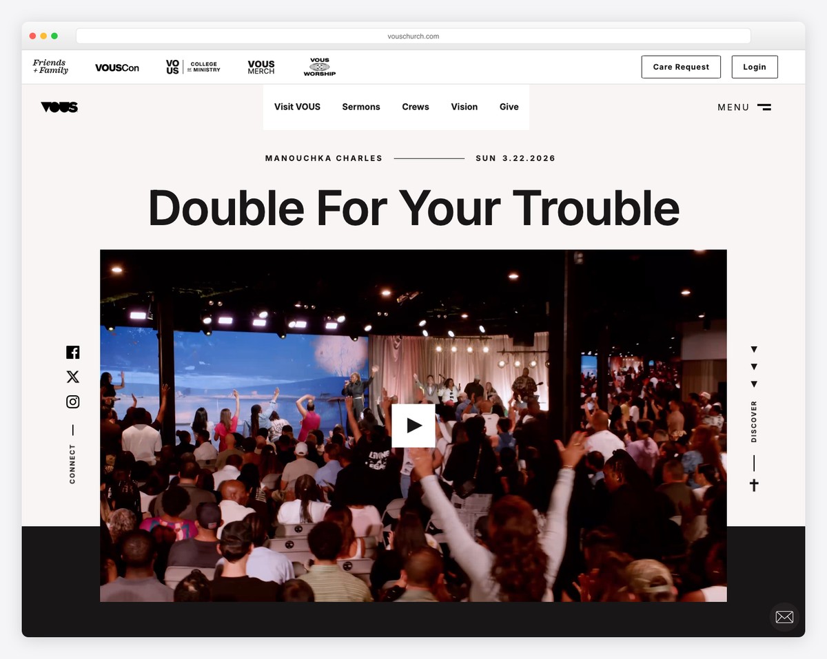
The era of mega-menus with 30+ links is over. The best church websites in 2026 have five navigation items or fewer. Typically: About, Visit, Sermons, Give, and a catch-all like “Connect” or “Next Steps.”
Why? Because more choices lead to fewer decisions. This is Hick’s Law — the more options you present, the longer it takes someone to choose, and the more likely they are to choose nothing. When a visitor lands on your site, you want them to click “Plan Your Visit.” A navigation bar with 12 items makes that click less likely, not more.
What about all those other pages — staff directory, small groups, events, prayer requests, member login? Put them in a secondary menu, the footer, or under a dropdown. They’re important for regular members, but they shouldn’t compete for attention with visitor-facing navigation.
Look at churches like Elevation Church or Life.Church — massive organizations with dozens of programs, yet their main navigation has five or six items. If they can simplify, so can you.
The old approach to sermon archives — a chronological list with dates and titles — is dying. In its place: visual, series-based browsing that looks and feels like Netflix.
That means:
This matters because sermon content is typically the second most-visited section of a church website. If your archive is an ugly list, you’re underserving both members (who want to re-watch) and visitors (who want to preview your teaching). We cover the full approach in our sermon archive guide.
Nothing kills trust faster than stock photos on a church website. That perfectly diverse group of twenty-somethings laughing in a field? Every visitor knows it’s fake. And if your photos are fake, they’ll wonder what else is.
In 2026, the churches with the best websites invest in authentic photography:
You don’t need a professional photographer (though hiring one for a Sunday morning shoot once a year is a great investment). A volunteer with a decent phone camera and good natural light can produce photos that are 10x more effective than any stock image. The key is showing your people in your space.
Check out the small church website examples in our gallery — the ones that feel most inviting all use real photography, even if the production quality is modest.
For years, church websites defaulted to light, airy designs — white backgrounds, soft blues, gentle gradients. That’s still fine, but a significant shift toward dark-mode designs and bold color palettes is happening in 2026.
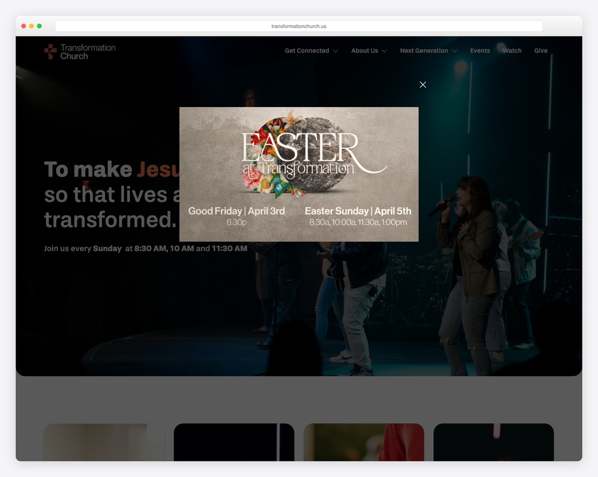
Dark backgrounds with high-contrast text and vibrant accent colors create a modern, premium feel. Churches like Elevation Church, Transformation Church, and Vous Church have popularized this aesthetic — and it works because it looks intentional and confident.
If you go dark, keep these principles in mind:
This trend isn’t for every church. If your congregation skews older and traditional, a clean light design may feel more appropriate. But if you’re trying to reach a younger demographic, dark mode signals “we’re current.”
The old approach: one “Give” page buried in the navigation. The new approach: giving is woven into the entire website experience.
In 2026, the most effective church websites include giving prompts in contextually relevant places:
This isn’t about being aggressive with donation requests. It’s about making generosity easy and showing people the impact of their giving. When someone feels moved by a sermon and wants to give, they shouldn’t have to hunt for the page. For setup guidance, see our online giving guide.
Multi-site churches used to cram all their campuses onto one website with a generic experience. That’s changing. The trend in 2026 is location-specific landing pages that feel like individual church websites within a unified brand.
Each campus page includes:
Some churches even use geolocation to automatically suggest the nearest campus when someone first visits the site. Church of the Highlands and North Point Ministries do this well — you pick your location, and the entire site personalizes around it.
Even if you’re not multi-site yet, this is worth noting: if you have plans to expand, choose a website platform that supports multi-location content management. Retrofitting it later is painful.
A sticky CTA is a call-to-action button that stays visible as visitors scroll — usually pinned to the bottom of the screen on mobile. In 2026, more churches are using these for their highest-priority actions:
Smart banners — announcements that appear at the top of the site and can be updated easily — are replacing the old homepage slider (which nobody clicks). They’re simple, text-based, and immediately communicate what’s most important right now.
The key is restraint. One sticky CTA, one banner at a time. Multiple competing pop-ups and banners create chaos and drive visitors away. Pick your single most important action and make that the sticky CTA.
In 2025, many churches maintained websites with 30, 40, even 50+ pages — most of them outdated or barely visited. The 2026 trend is aggressive simplification: fewer pages, but each one doing more work.
Instead of separate pages for every ministry, group, and program, leading churches are consolidating. A single “Get Connected” page with sections for small groups, serving teams, classes, and events replaces five separate pages that each had thin content.
The benefits are huge:
For a practical guide to what pages your church actually needs, see our essential church website pages guide.
This is less a design trend and more a platform trend — but it’s shaping church website design in a big way. Squarespace has become the dominant platform for well-designed church websites, especially among church plants, creative churches, and congregations under 500.
Why? Because Squarespace makes good design the default. Its templates are modern, its typography is polished, and it’s nearly impossible to make an ugly site on the platform. Compare that to WordPress, where design quality depends entirely on the theme and builder you choose — and many churches choose poorly.
The result is a generation of church websites that all share certain Squarespace DNA: clean sans-serif fonts, generous white space, full-bleed images, and that distinctive Squarespace “feel.” Churches like Anchor Church, Reality LA, and hundreds of others are all on Squarespace — and they all look great.
The trade-off is flexibility. Squarespace is opinionated about design, which means you get fewer customization options than WordPress. For most churches, that’s a feature, not a bug. But if you need advanced functionality (custom member portals, complex integrations), WordPress or a church-specific platform like Tithe.ly or Subsplash may be a better fit. We compare the options in our Squarespace vs. WordPress for churches article.
You don’t need to redesign your entire website to apply these trends. Here’s a prioritized action list you can work through over the next few months:
Design trends come and go, but the principle behind all 10 of these is timeless: design for visitors first, make the next step obvious, and keep it simple. Do that, and your church website will serve your ministry well regardless of what’s trending next year.
The trends above tell you what to do. These are the mistakes we see most often — the ones that quietly turn first-time visitors away:
A full redesign every 3-4 years is reasonable. But you should be making incremental updates constantly — new photos quarterly, content refreshes monthly, and small design improvements as you identify issues. A website that gets regular updates never feels “old.”
Selectively, yes. Your visitors spend their day on well-designed websites and apps. They expect a certain baseline of quality and usability. You don’t need to look like Apple, but you shouldn’t look like a website from 2015, either. The trends in this guide are specifically the ones that translate well to church contexts.
Not necessarily. Design should reflect your church’s personality. If your congregation values warmth and tradition, a clean light design with classic fonts might be more appropriate. Dark mode works best for contemporary churches targeting younger demographics. There’s no one-size-fits-all.
Absolutely. Most of these trends are about decisions, not design skills. Simplifying your navigation, replacing stock photos, and adding a sticky CTA are things anyone can do on Squarespace or Tithe.ly in a weekend. The platform does the heavy design lifting — you just need to make smart content and layout decisions.

Church Website Examples
Church Website Examples
Church Website Examples
10 complete church website templates, MIT licensed. Browse every demo freely; we will email you whichever folder you want.
All templates