How to Write Church Website Copy That Converts Visitors
Most church websites have a writing problem, not a design problem. The design might be beautiful, but the words say things like “Join us for an incredible time of worship and fellowship as we explore God’s Word together in community.” That sentence says nothing. It could describe any church in America. And first-time visitors — the people you most need to reach — will scroll right past it.
Good church website copy is specific, clear, and written for the person who’s never stepped foot in your building. Here are five rules that will transform your website from forgettable to compelling, plus page-by-page tips for your most important pages.
In This Guide
Rule 1: Write for Visitors, Not Members
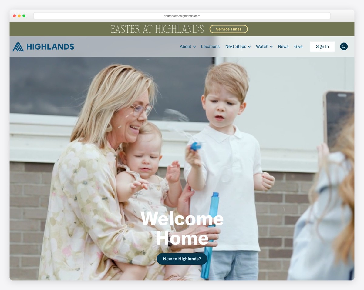
Your church members already know who you are. They know the pastor, the service style, the inside jokes, the history. They don’t need the website to convince them of anything. First-time visitors need the website for everything — and they’re the primary audience.
Before publishing any page, read it from the perspective of someone who has never been to your church and may not have been to any church in years. Would they understand everything on this page? Would they know what to do next? Would they feel welcomed or confused?
A practical test: show your homepage to someone outside your church — a neighbor, a coworker, someone from a different faith tradition. Ask them to tell you, in their own words, what your church is about and what they should do next. If they can’t articulate both clearly, your copy needs work.
Rule 2: Kill the Jargon
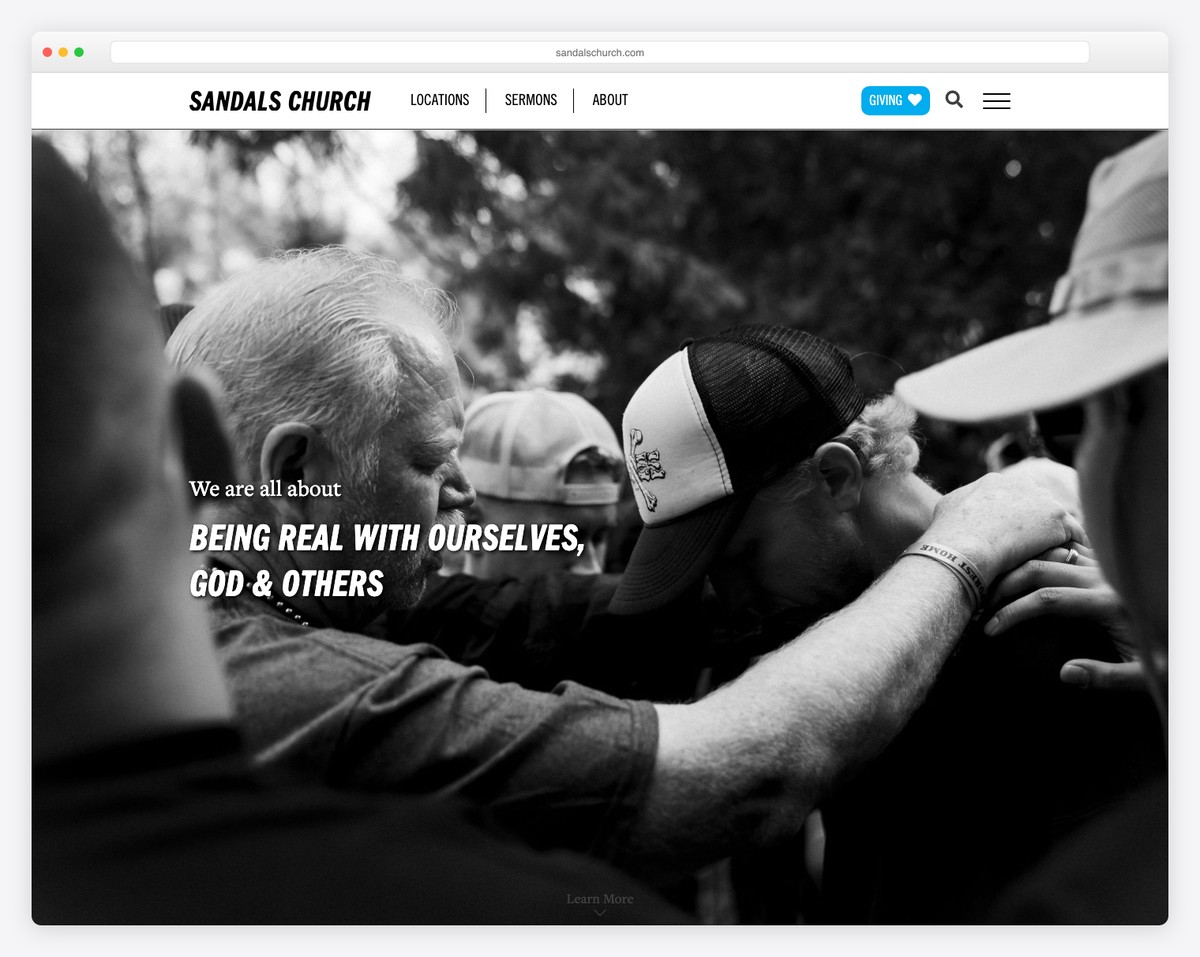
Church culture has its own language, and that language is invisible to insiders. Words and phrases that feel normal to you are foreign to visitors. Here are common offenders and better alternatives:
| Jargon | What Visitors Hear | Better Alternative |
|---|---|---|
| “Fellowship” | Unclear/religious | “Hang out together” or “community” |
| “Sanctuary” | Formal/intimidating | “Worship room” or “auditorium” |
| “Narthex” | Complete confusion | “Lobby” or “entrance area” |
| “We’d love to do life with you” | Cliche, vague | “We’d love to meet you this Sunday” |
| “Plug in” | Unclear what this means | “Get involved” or “join a group” |
| “Season of life” | Churchy language | Be specific: “Whether you’re single, married, or raising kids” |
| “Body of Christ” | Confusing for newcomers | “Our church community” |
| “VBS” | Acronym — meaningless | “Vacation Bible School (VBS) — our summer kids’ program” |
This doesn’t mean dumbing down your theology. It means writing in a way that invites understanding rather than assuming it. Your beliefs page can be theologically robust and still use accessible language.
Rule 3: Be Specific, Not Generic
Generic copy is the enemy of trust. When everything on your website could apply to any church, visitors have no reason to choose yours. Specificity builds credibility and helps people picture themselves at your church.
Before and after examples:
Homepage Welcome
Generic: “Welcome to Grace Church! We’re a loving community that welcomes everyone.”
Specific: “Grace Church is a community of 300 people in downtown Springfield. We gather every Sunday at 10 AM for worship, and throughout the week in living rooms across the city for small groups. Come as you are — jeans are the norm, not the exception.”
About Page
Generic: “We are passionate about reaching our community with the love of Christ.”
Specific: “Last year, our church served 4,200 meals at the Springfield Rescue Mission, sent three teams to build homes in Honduras, and launched six new small groups for young professionals. We believe faith works best when it gets its hands dirty.”
Children’s Ministry
Generic: “Your kids will love our children’s ministry!”
Specific: “Every Sunday, 45 kids from birth through 5th grade learn Bible stories through crafts, games, and small group discussions. All 23 of our children’s volunteers are background-checked, and we use a secure check-in system so your child is safe from drop-off to pick-up.”
See the difference? Specificity proves your claims instead of just making them.
Rule 4: Answer the Questions Visitors Actually Have
Visitors come to your website with specific questions. If your website doesn’t answer them quickly, visitors leave. Here are the questions every church website must answer:
- When and where are your services? (Service times + address + map)
- What’s the service like? (Worship style, length, dress code)
- Is there anything for my kids? (Children’s ministry details, ages, safety)
- What does this church believe? (Clear beliefs page)
- Who’s the pastor? (Name, photo, brief bio, teaching sample)
- Will I feel welcome? (Tone, photos of real people, “Plan Your Visit” page)
These questions should be answered on your homepage or within one click of it. If a visitor has to dig through multiple pages to find service times or parking information, your site structure needs work. See our essential pages guide for the complete list.
Rule 5: Short Sentences and White Space
People don’t read church websites — they scan. Long paragraphs, dense text, and wall-of-text pages get skipped entirely. Write for scanners:
- Keep paragraphs to 2-3 sentences maximum
- Use bullet points for lists of information
- Use headings and subheadings to break up every section
- Bold key phrases so scanners catch the important parts
- Leave plenty of white space between sections
Your pastor’s 5,000-word theology paper doesn’t belong on the beliefs page. Your 12-paragraph church history doesn’t belong on the about page. Write tight, then cut 30%.
Page-by-Page Copywriting Tips
Homepage
Your homepage headline should answer “What is this church, and why should I care?” in under 10 words. Follow it with service times, a “Plan Your Visit” button, and a brief welcome message. Don’t try to put everything on the homepage — guide visitors to the next step. The homepage is a front door, not a filing cabinet. For the complete formula, see our homepage guide.
About Page
Lead with who you are today, not your founding story from 1952. Visitors want to know what your church is like now. Include your mission in one sentence, 2-3 values with brief explanations, and your story in 200 words or less. Photos of your actual community — not stock images — build trust instantly.
Plan Your Visit Page
This is your most important conversion page. Address every concern a first-timer might have: What should I wear? (Be honest — “Most people wear jeans and casual clothes.”) Where do I park? What happens when I walk in? How long is the service? What about my kids? Is there coffee? Write this page as if you’re personally welcoming a nervous friend.
Sermons Page
Each sermon listing needs a compelling title (not just the Bible reference), a one-sentence description, and the series name. “Sermon from Romans 8” says nothing. “Unstoppable: How God’s Love Changes Everything — Romans 8:28-39” creates interest. For archive best practices, see our sermon archive guide.
Give Page
Don’t just plop a giving form on a blank page. Briefly explain why giving matters and how funds are used. “Your generosity funds our children’s ministry, local food pantry, and global mission partners” is more compelling than “Click below to give.” Make the actual giving process as simple as possible — minimal clicks, clear amounts, easy recurring setup. See our giving guide for setup details.
Frequently Asked Questions
Should we hire a professional copywriter for our church website?
If your budget allows, a professional copywriter who understands church culture can transform your website. Expect to pay $500-2,000 for a full church website copywriting project. The investment pays off in better visitor conversion. If hiring isn’t possible, assign your best communicator (often not the pastor — someone who writes concisely) to apply the rules in this guide.
How long should our homepage text be?
Your homepage text content (not including navigation, footer, etc.) should be scannable in under 30 seconds. That means roughly 200-400 words total, broken into short sections with headings. The most important information — service times, location, and a welcome statement — should be visible without scrolling on both desktop and mobile.
Can we use AI to write our church website copy?
AI can generate a first draft, but it almost always produces generic, jargon-filled church copy — exactly the kind this guide warns against. If you use AI, treat its output as a starting point and heavily edit for specificity, jargon removal, and your church’s authentic voice. The specific details that make copy compelling (your church’s actual numbers, stories, and personality) must come from a human.
How often should we update the copy on our website?
Review your homepage and key pages quarterly. Update staff information and ministry descriptions whenever changes happen. Refresh photography annually. The biggest red flag is outdated information — wrong service times, departed staff members still listed, past events still promoted. For a complete schedule, see our maintenance checklist.
Should our pastor write the website copy?
Pastors are often excellent communicators from the pulpit but write too much for a website. Web copy needs to be concise, scannable, and action-oriented — skills that don’t always translate from sermon preparation. The pastor should provide input on voice, values, and theology, but the actual web copy is often better written by someone who naturally writes short.