83% of people check a church’s website before visiting in person. And those visitors make a judgment about your church in 3-5 seconds — before they read a single word. Your homepage is the digital front door of your church, and it’s either inviting people in or turning them away before they ever set foot in your building.
The good news: you don’t need to guess what works. After analyzing hundreds of church websites — including the standouts in our top 50 church website designs — we’ve identified a formula that consistently converts first-time website visitors into first-time church visitors.
In This Guide
This guide gives you the exact section-by-section blueprint for a church homepage that works. What goes where, why it matters, what to write, and what to avoid.
Why Your Homepage Structure Matters
Your homepage has one primary job: help first-time visitors take the next step — whether that’s attending a service, watching a sermon, joining a group, or learning more about your church. Everything on the page should serve that goal.
The secondary job is helping regular members quickly find what they need: service times, upcoming events, the latest sermon, and ways to get involved. These people already know your church — they need navigation, not persuasion.
A well-structured homepage serves both audiences simultaneously. Here’s how.
The Section-by-Section Homepage Formula
Think of your homepage as a series of sections that scroll vertically. Each section has a specific purpose and order matters — visitors scan top to bottom, and the most important information goes first.
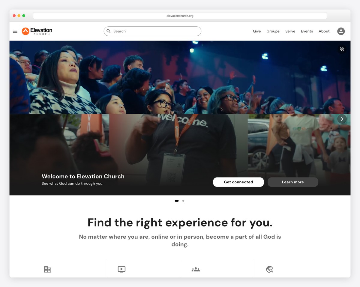
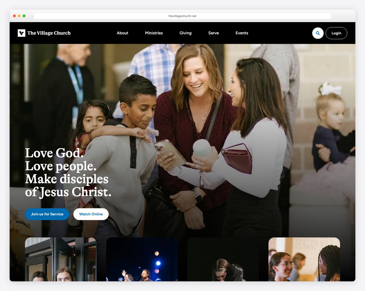
Section 1: Hero — Your First Impression
This is the first thing visitors see, and it determines whether they stay or leave. The hero section takes up the full screen (or close to it) and needs three elements:
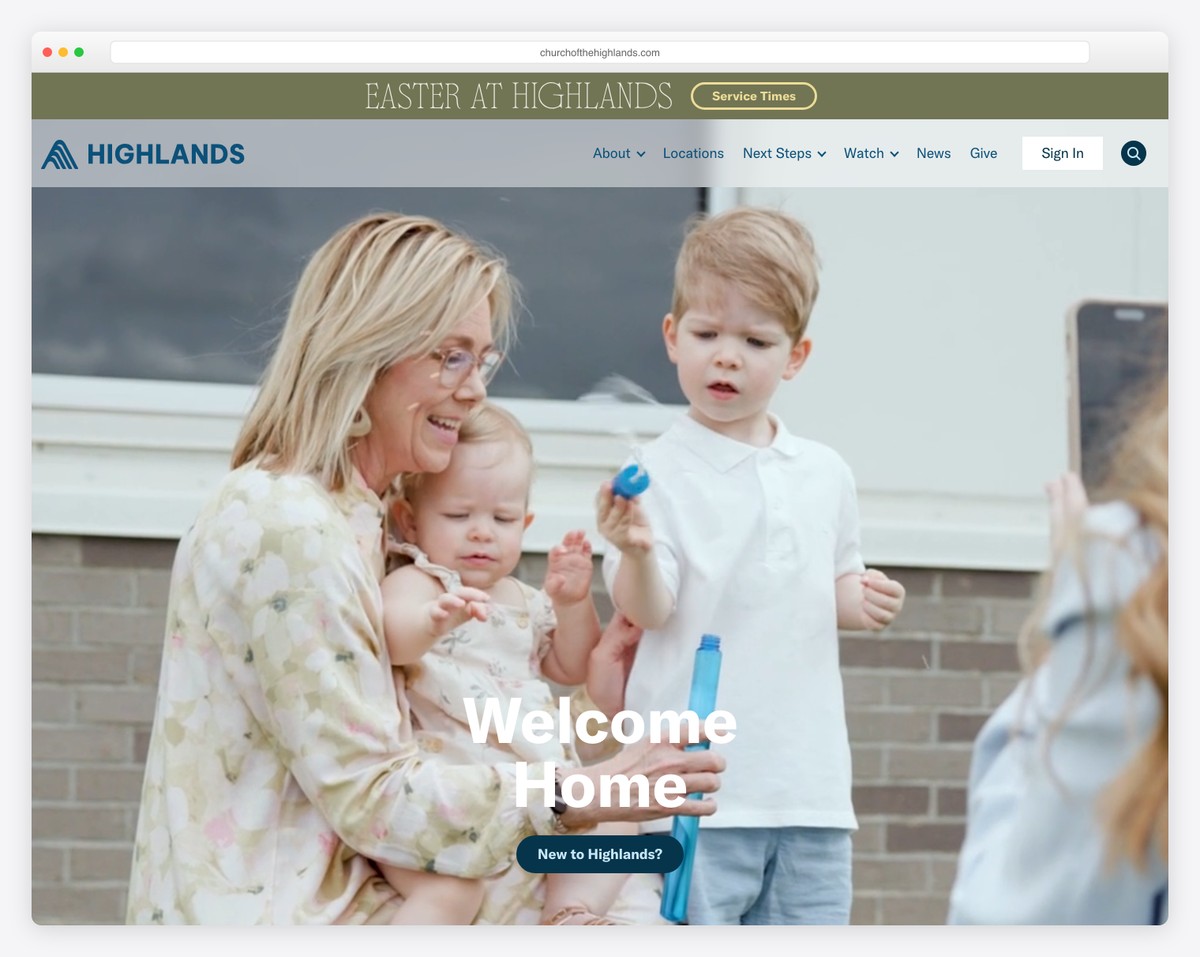
A warm, authentic photo. Not a stock photo. Not a photo of your building exterior. A photo of real people at your church — worshipping, laughing, serving, connecting. This photo tells visitors what it feels like to be at your church. The best hero photos show diversity (age, ethnicity, families), genuine emotion, and community. If you don’t have a great photo yet, schedule a Sunday morning photo session — it’s the single highest-impact investment for your website.
A welcoming headline. Keep it short (5-8 words) and visitor-focused. The headline should answer the question: “What’s this church about, and is it for me?”
Good headlines:
- “A Place to Belong in [City]”
- “You’re Welcome Here”
- “Real People. Real Faith. Real Community.”
- “Come as You Are”
Avoid:
- “Welcome to First Baptist Church of Springfield, Illinois” (too formal, too long)
- “Loving God, Loving People, Serving the World” (generic mission statement)
- “For God so loved the world…” (Bible verse as headline — meaningful to members, unclear to visitors)
A clear call-to-action button. One button, prominently visible, that tells visitors what to do next. “Plan Your Visit,” “Join Us Sunday,” or “Watch This Week’s Sermon” are all effective. Avoid generic buttons like “Learn More” — be specific about what happens when they click. For more on effective church website copy, see our dedicated guide.
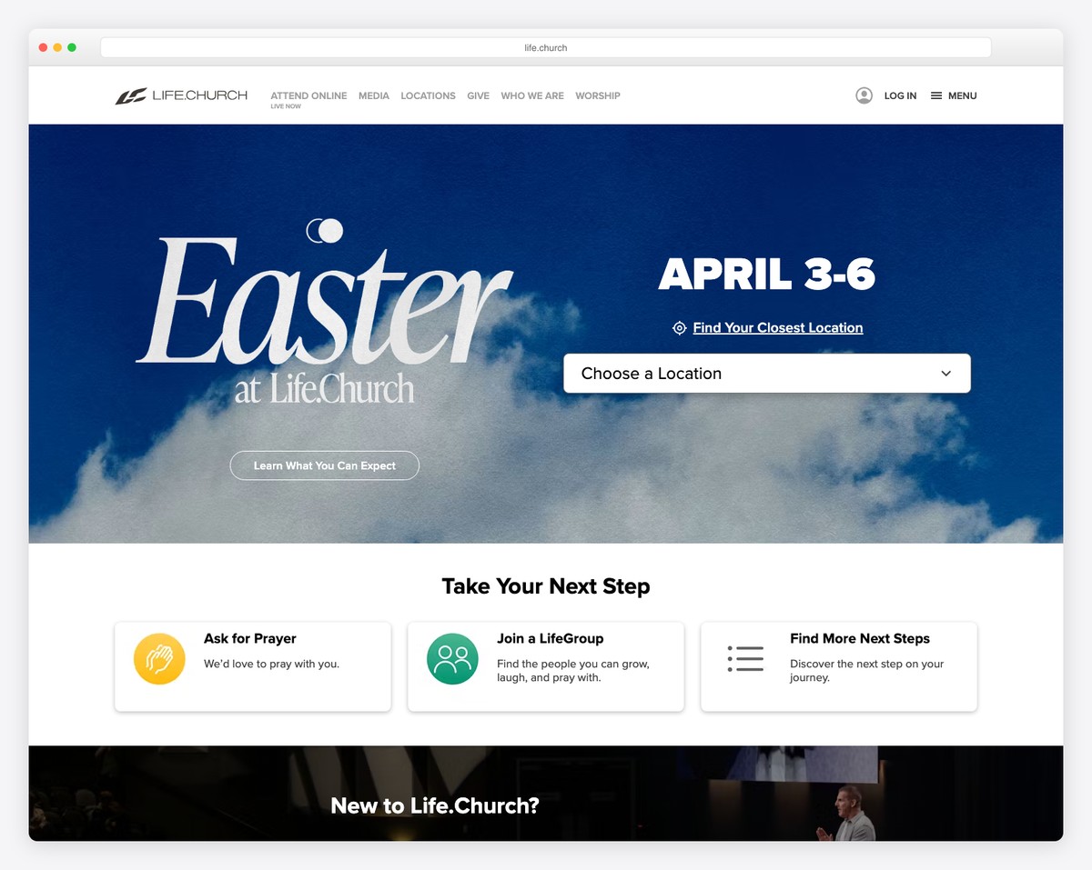
Section 2: Service Times and Location
This is the most-searched information on any church website. Service times, day of the week, and your address should be immediately visible below the hero — no clicking required.
Format it cleanly:
- Day and time: “Sundays at 9:00 AM & 10:30 AM”
- Address: Full street address with a link to Google Maps
- Additional services: Wednesday night, youth service, etc. — list them briefly
If you’re multi-campus, show all campuses with their respective times and addresses. Consider an embedded Google Map or a “Get Directions” button that opens navigation on mobile devices.
Don’t bury service times on a separate page. The single most common reason people visit a church website is to check when services happen. Make this effortless.
Section 3: Current Sermon Series
Feature your current or most recent sermon series with the series artwork, a brief description, and a button to watch or listen. This section does double duty:
- For visitors: It shows your church produces quality content and takes teaching seriously. A compelling sermon series can be the nudge that turns an online visitor into an in-person visitor.
- For members: Quick access to catch up on a sermon they missed or re-listen to one that resonated.
Include a “View All Sermons” link that takes people to your full sermon archive. If you haven’t set up a sermon archive yet, that guide walks you through it step by step.
Section 4: Three Pathway Cards
This is one of the most effective homepage elements and one that many churches miss. Three cards (side by side on desktop, stacked on mobile) that guide visitors to their next step based on where they are in their journey.
The classic three pathways:
- “I’m New” — Links to your “Plan Your Visit” or “What to Expect” page. Answers first-timer questions: What do I wear? Where do I park? What about my kids?
- “Get Connected” — Links to small groups, volunteer opportunities, or a connect card. For people who’ve visited and want to go deeper.
- “Watch Online” — Links to your live stream or sermon archive. For people not ready to visit in person or for members who missed a Sunday.
Each card should have a relevant photo, a 1-2 sentence description, and a clear button. These three cards act as a simplified navigation system — they answer the question “What should I do next?” for visitors at different stages.
Some churches customize these pathways to their ministry priorities. “Children’s Ministry,” “Youth Group,” and “Serve” are common alternatives. Choose pathways that reflect your church’s actual engagement strategy. For guidance on what pages to build behind these cards, see our essential church website pages guide.
Section 5: Upcoming Events (2-3 Max)
Show your next 2-3 upcoming events — not your entire calendar. This keeps the homepage fresh and dynamic without overwhelming visitors with information they don’t need yet.
For each event, include:
- Event name
- Date and time
- One sentence description
- Link to full event details or registration
Add a “View All Events” link for people who want to see the full calendar. The homepage events section is a highlight reel, not a comprehensive listing.
⚠️ Important: If you show events on your homepage, you must keep them updated. Nothing signals “this church is inactive” faster than past events still displayed on the homepage. If you can’t commit to updating events regularly, consider removing this section entirely or using a dynamic calendar integration that updates automatically.
Section 6: Brief About Section
Not your full “About Us” page — a brief, warm introduction to your church. Three to four sentences maximum. The goal is to give visitors a sense of your church’s personality and values without requiring them to read a full page.
Example: “Grace Community Church is a welcoming, multi-generational church in downtown Austin. We believe church should feel like family — a place where everyone belongs, questions are welcome, and real life happens together. Whether you’ve been following Jesus for decades or you’re just curious, there’s a seat for you here.”
Include a “Learn More About Us” button that links to your full About page. Include a photo of your congregation or a candid shot from a recent gathering — something that puts faces to the words.
Section 7: Footer
The footer appears on every page, not just the homepage, but it’s worth getting right. Include:
- Service times and address (yes, repeat them — people scroll to the footer when they can’t find this info)
- Contact information — phone number and email
- Social media links — icons for Facebook, Instagram, YouTube (whatever you actively use)
- Quick links — Give, Sermons, Contact, Plan Your Visit
- Give button — always include a giving link in the footer
For more on setting up online giving placement across your site, including footer best practices, see our giving guide.
What NOT to Put on Your Homepage
Knowing what to leave off is just as important as knowing what to include. These are common homepage mistakes that hurt visitor experience:
Your Full Mission Statement
“We exist to glorify God by making disciples who worship passionately, connect authentically, serve sacrificially, and give generously while sharing the gospel locally, nationally, and internationally.”
Mission statements like this are meaningful to your leadership team but meaningless to a first-time visitor. They’re too long, too abstract, and filled with church jargon. Save your mission statement for the About page and use plain, warm language on the homepage instead.
A Wall of Announcements
Bulletin-board homepages — packed with every announcement, potluck signup, and committee meeting — are one of the most common church website failures. Your homepage is not a bulletin board. It’s a welcome mat. Announcements belong in your weekly email, your app, or a dedicated “News” page.
The exception: 2-3 major upcoming events (as described in Section 5). But “major” means events that visitors might care about — not the deacons’ meeting.
Auto-Playing Audio or Video
Nothing drives visitors away faster than unexpected sound. If someone opens your website at work, on the bus, or at 11 PM while their family is sleeping, auto-playing media is jarring and embarrassing. Always let visitors choose when to play media. Auto-playing video (muted) as a hero background is acceptable if done tastefully, but auto-playing audio is never acceptable.
The Pastor’s Blog on the Homepage
Your pastor may be a brilliant writer, but the homepage isn’t the place for blog posts. First-time visitors don’t know your pastor yet and won’t read a 500-word devotional before they’ve even decided to attend. The blog belongs in the navigation menu, linked from the footer, or featured in your email newsletter — not dominating prime homepage real estate.
Outdated Content
A Christmas event displayed in March. A “Back to School” event in November. A sermon series from six months ago. Outdated content tells visitors your church doesn’t care about its online presence — and by extension, might not care about newcomers either. If you can’t keep homepage content current, simplify your homepage to elements that don’t require frequent updates (hero photo, service times, about section).
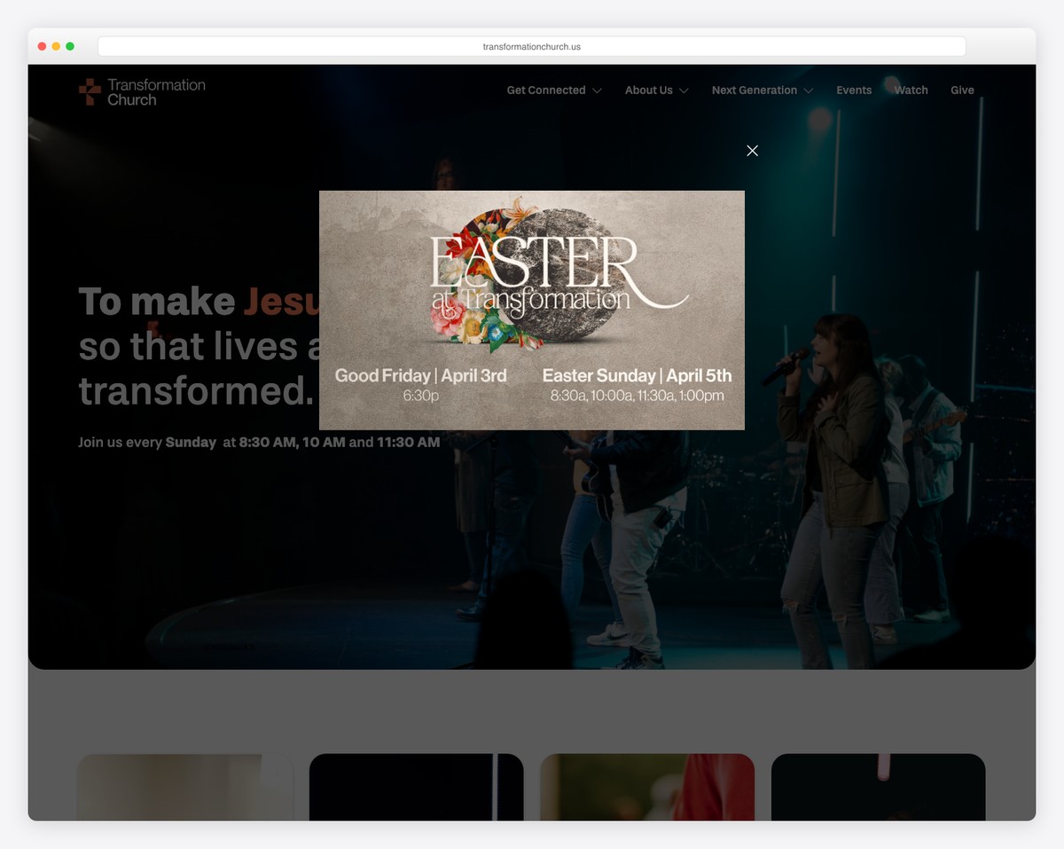
Pop-Up Overload
Email signup pop-ups, chat widgets, notification requests, and cookie banners — all firing simultaneously when someone lands on your page. Each individual element might be useful, but together they create a hostile first experience. Limit pop-ups to one, delay it by at least 15 seconds, and make it easy to dismiss.
Common Homepage Mistakes
Beyond the “what not to include” list, these structural and design mistakes weaken church homepages:
- Too many navigation links. More than 7 main navigation items overwhelms visitors. Consolidate: “About” can contain sub-pages for staff, beliefs, and history. “Ministries” can contain children, youth, and small groups. Aim for 5-7 top-level items.
- Stock photos instead of real photos. Generic stock images of diverse people laughing at nothing are worse than no photos at all. They feel inauthentic, and visitors recognize them instantly. Real photos of your real community — even imperfect ones — are 10x more effective.
- No mobile optimization. Over 60% of church website traffic comes from phones. If your homepage doesn’t look great on mobile — large text, tappable buttons, fast loading — you’re losing the majority of your visitors. Check our church website launch checklist for mobile testing essentials.
- Slow loading speed. If your homepage takes more than 3 seconds to load, over 50% of mobile visitors will leave before they see anything. Compress images, minimize plugins, and choose fast hosting. See our guide on essential church website features for performance best practices.
- Insider language. “Join a Life Group!” means nothing to someone who doesn’t know what a Life Group is. Use plain language: “Find a Small Group” or “Connect with Community.” Avoid acronyms, church jargon, and denominational terminology on the homepage.
- No clear next step. Visitors should never think “Now what?” Every section should have a clear action — a button, a link, a direction. If someone reads your entire homepage and doesn’t know what to do next, your homepage has failed.
Mobile Homepage Considerations
Since the majority of your church website visitors are on phones, your homepage needs to work beautifully on small screens. Here’s what changes on mobile:
Simplified Navigation
Your 7-item desktop navigation collapses into a hamburger menu (three horizontal lines). The most important items — “Plan Your Visit,” “Give,” and “Sermons” — should be easy to find within one tap of the menu. Some churches add a persistent “Give” button that stays visible even when scrolling.
Larger Touch Targets
Buttons need to be large enough to tap easily on a phone screen — at least 44×44 pixels. Text links that work fine on desktop with a precise mouse cursor become frustrating on mobile when fingers are less precise. Make buttons obvious and generously sized.
Stacked Layout
Your three pathway cards that sit side-by-side on desktop will stack vertically on mobile. Make sure they stack in a logical order and that the spacing between sections feels intentional, not cramped. Most modern website builders handle this automatically, but always preview and test.
Speed Matters More on Mobile
Mobile connections are often slower than desktop connections, especially in rural areas. Compress your hero image aggressively (under 200KB if possible), lazy-load images below the fold, and test your page speed using Google’s PageSpeed Insights tool. A fast mobile homepage is more important than a fancy mobile homepage.
Click-to-Call and Click-to-Navigate
On mobile, phone numbers should be tappable (opening the phone dialer) and addresses should be tappable (opening maps with navigation). These one-tap actions are expected on mobile — if your phone number is just text that can’t be tapped to call, you’re adding unnecessary friction.
Homepage Formula Checklist
Use this quick-reference checklist to audit your current homepage or plan a new one:
- ☐ Hero section with authentic photo, welcoming headline, and one clear CTA
- ☐ Service times and location visible without clicking
- ☐ Current sermon series featured with watch/listen link
- ☐ Three pathway cards for different visitor types
- ☐ 2-3 upcoming events (current, not outdated)
- ☐ Brief about section (3-4 sentences, warm tone)
- ☐ Footer with service times, contact, social links, and giving link
- ☐ “Give” link in main navigation
- ☐ No mission statement wall of text
- ☐ No auto-playing audio
- ☐ No outdated events or content
- ☐ No insider language or church jargon
- ☐ Mobile-friendly with large touch targets
- ☐ Page loads in under 3 seconds on mobile
- ☐ Real photos, not stock photos
For a complete pre-launch audit that goes beyond the homepage, use our church website launch checklist.
Frequently Asked Questions
How long should a church homepage be?
Following this formula, your homepage will be about 5-7 scrollable sections. On desktop, that’s roughly 3-5 screen lengths of scrolling. On mobile, slightly more. This is the sweet spot — long enough to give visitors everything they need, short enough that they don’t abandon the page mid-scroll. Don’t try to put everything on the homepage; that’s what your other pages are for.
Should we include a video on the homepage?
A short (60-90 second) welcome video can be very effective — if it’s high quality. A well-produced video of your pastor welcoming visitors, showing clips of worship, community life, and your space gives visitors a feel for your church that photos alone can’t convey. However, a low-quality video hurts more than it helps. If you can’t produce something you’re proud of, skip the video and invest in great photography instead. Never auto-play video with sound.
What about a slider/carousel at the top of the homepage?
Avoid them. Studies consistently show that homepage sliders (rotating banners) have extremely low click rates — typically under 1%. Most visitors never see anything past the first slide. They also slow down page loading and create accessibility issues. Replace sliders with a single, strong hero section that communicates your message clearly.
How often should we update the homepage?
Update the sermon series section weekly (or whenever a new series starts). Update events as they change. Refresh the hero photo seasonally or for major series. The about section, pathway cards, and service times only change when the underlying information changes. For a maintenance schedule that covers the whole site, see our dedicated guide.
Should we show a live stream link on the homepage?
Yes — if you stream regularly. A “Watch Live” button in the hero section during service times (that switches to “Watch Latest Sermon” at other times) is an effective pattern used by many growing churches. Just make sure the link works and leads somewhere useful at all times — clicking “Watch Live” and getting a blank page or error is a bad experience.
How do we handle multiple campuses on the homepage?
Two approaches work well. First: a campus selector at the top of the homepage (or on initial visit) that tailors the content — service times, events, staff — to the selected campus. Second: a unified homepage with a “Locations” section showing all campuses with their respective times. The first approach is more personalized but more complex to build. The second is simpler and works for most multi-campus churches under 5 locations.
What hero photo works best for a church website?
The ideal hero photo shows: real people from your actual congregation (not stock photos), genuine emotion (worship, laughter, connection), diversity in age and ethnicity (reflecting your community), and good production quality (proper lighting, sharp focus). A wide-angle shot during worship often works well because it shows energy, community, and your physical space simultaneously. Avoid photos of an empty building, a close-up of your pastor alone, or heavily staged group shots.
Putting It All Together
The church homepage formula isn’t complicated, but it requires intentionality. Every section serves a purpose, every element earns its place, and nothing is included just because “other churches do it.”
Here’s the order one more time:
- Hero (photo + headline + CTA)
- Service times and location
- Current sermon series
- Three pathway cards
- Upcoming events (2-3 max)
- Brief about section
- Footer
This formula works across every website builder — Squarespace, WordPress, Tithe.ly Sites, or any other platform. The platform determines how your homepage looks; this formula determines whether it works.
Start with the formula, then customize based on your church’s unique personality and priorities. And when you’re ready to build beyond the homepage, our essential church website pages guide covers every page your church needs and what to include on each one.
Leave a Reply