Church websites serve everyone — including people who navigate the web with screen readers, keyboards, voice commands, or magnification tools. Website accessibility isn’t just a technical requirement or legal checkbox. For a church, it’s a reflection of your values. If your building has a wheelchair ramp but your website can’t be used by someone who is blind, there’s a disconnect between what you preach and what you practice.
The good news: most accessibility improvements are straightforward and don’t require a redesign. This guide covers what accessibility means for churches, quick wins you can implement today, intermediate improvements, platform-specific tips, and the legal landscape.
In This Guide
What Website Accessibility Means
Web accessibility means designing and building your website so that people with disabilities can perceive, understand, navigate, and interact with it. This includes people who are blind or have low vision, deaf or hard of hearing, have motor disabilities that limit mouse use, have cognitive disabilities that affect comprehension, or experience seizure disorders triggered by flashing content.
The standard for web accessibility is the Web Content Accessibility Guidelines (WCAG), currently at version 2.2. WCAG has three levels: A (minimum), AA (recommended standard), and AAA (highest). Most organizations aim for AA compliance — that’s a practical target for church websites as well.
Accessibility matters especially for churches because your congregation likely includes elderly members with vision or hearing changes, people with disabilities who want to participate in online church life, and visitors with accessibility needs evaluating whether your church is truly welcoming.
Quick Wins: Fix These Today
These improvements take minutes to implement and address the most common accessibility barriers on church websites.
1. Add Alt Text to Every Image
Alt text is a text description of an image that screen readers announce to blind users. Every image on your website needs alt text. Without it, screen readers either skip the image entirely or read the file name (“IMG_4523.jpg”), which is meaningless.
Good alt text describes what’s in the image and why it matters:
- Bad: “image1” or empty alt text
- Better: “Church building”
- Best: “Grace Community Church exterior with white steeple against a blue sky”
For decorative images (background textures, dividers), use empty alt text (alt=””) so screen readers skip them. Every platform — Squarespace, WordPress, Wix, Tithe.ly — has a field to add alt text when you upload an image.
2. Ensure Sufficient Color Contrast
Text must have enough contrast against its background to be readable. Light gray text on a white background, or white text on a light-colored photo, fails this test. WCAG AA requires a contrast ratio of at least 4.5:1 for normal text and 3:1 for large text.
Use a free tool like WebAIM’s Contrast Checker (webaim.org/resources/contrastchecker) to test your color combinations. Common church website offenders: light gray body text, white text overlaid on unfiltered photos, and light-colored links that blend with surrounding text.
3. Write Descriptive Link Text
Screen reader users often navigate by jumping between links. Links that say “Click here” or “Learn more” are meaningless out of context. Every link should describe where it goes:
- Bad: “Click here to learn about our services”
- Good: “View our Sunday service times and locations”
- Bad: “Learn more”
- Good: “Read about our children’s ministry programs”
4. Use Proper Heading Structure
Headings (H1, H2, H3) aren’t just visual formatting — they create a document outline that screen readers use for navigation. Screen reader users often scan a page by jumping between headings, similar to scanning bold text visually.
Rules for heading structure:
- Each page should have exactly one H1 (the page title)
- Use H2 for major sections, H3 for subsections within those
- Don’t skip levels (don’t jump from H2 to H4)
- Don’t use headings just to make text bigger — use CSS for styling
5. Add Captions to Videos
Sermon videos, welcome videos, and event recaps need captions for deaf and hard-of-hearing visitors. YouTube auto-generates captions (which you should review and correct), and most video platforms support caption uploads. If your church live streams, enable live captions — many platforms now offer this feature.
Captions also help visitors watching in noisy environments or with the sound off on their phones — which is more common than you might think.
6. Enable Keyboard Navigation
Many people with motor disabilities navigate using only a keyboard (Tab, Enter, Arrow keys). Test your website by unplugging your mouse and navigating with just the keyboard. Can you reach every link, button, and form field? Can you see where the focus is (a visible outline around the active element)? If not, your site has keyboard accessibility issues.
Most website platforms handle basic keyboard navigation automatically if you use standard elements (links, buttons, form fields). Problems arise when custom JavaScript replaces standard elements — hamburger menus, modal windows, and image sliders are common offenders.
Intermediate Improvements
Once you’ve handled the quick wins, these improvements bring your site closer to full WCAG AA compliance.
Add Labels to All Form Fields
Every form field — name, email, phone, message — needs a visible label that’s properly associated with the input field in the HTML. Placeholder text inside the field is not a substitute for a label. Screen readers need the label to tell users what information to enter. This applies to contact forms, prayer request forms, event registration, and giving forms.
Don’t Rely on Color Alone
If your event calendar uses color to distinguish event types (blue for worship, green for youth, red for missions), that information is invisible to colorblind users. Always supplement color with text labels, icons, or patterns. Same for form validation — don’t just turn a field border red when there’s an error. Add a text message explaining the error.
Make PDFs Accessible
Many churches upload bulletins, newsletters, and forms as PDFs. Scanned PDFs (images of text) are completely inaccessible to screen readers. If you must use PDFs, ensure they’re created from digital documents (not scans), have a proper reading order, include alt text for images, and use tagged headings. Better yet, publish the content as web pages instead of PDFs when possible.
Test with a Screen Reader
The most revealing test is to experience your website the way a blind person does. VoiceOver (built into every Mac and iPhone) and NVDA (free for Windows) are screen readers you can use today. Turn off your monitor, launch the screen reader, and try to find your service times, listen to a sermon, and submit a contact form. The experience will likely surprise you — and motivate improvements.
Add a Skip Navigation Link
A “Skip to main content” link at the top of every page lets keyboard users bypass the navigation menu and jump directly to the page content. Without it, keyboard users must Tab through every navigation link on every page load before reaching the content they came for. This is a simple addition that significantly improves the keyboard experience.
Use ARIA Labels Sparingly and Correctly
ARIA (Accessible Rich Internet Applications) labels provide additional context for screen readers. The most common use: adding aria-label attributes to icon-only buttons (like a hamburger menu icon or social media links) that don’t have visible text. For example, a Facebook icon link should have aria-label=”Visit our Facebook page.” But don’t overuse ARIA — native HTML elements (buttons, links, headings) are already accessible when used correctly.
Accessibility by Platform
Squarespace
Squarespace templates generally have good baseline accessibility — proper heading structure, keyboard-navigable menus, and focus indicators. However, some templates have contrast issues with default color schemes, and custom design choices (like text over images) can create accessibility problems. Always add alt text to your images and test contrast on any customized colors.
WordPress
WordPress accessibility varies dramatically by theme. Some themes are built with accessibility in mind (look for themes tagged “accessibility-ready” in the theme directory). Others ignore it entirely. If accessibility is a priority, choose a theme that declares WCAG compliance and test it before committing. Plugins can add accessibility features, but they can’t fix a fundamentally inaccessible theme.
Tithe.ly Sites
Tithe.ly Sites handles basic accessibility on the platform level, but content creators still need to add alt text, maintain heading structure, and ensure color contrast. The platform’s templates are generally well-structured, but custom sections may need manual accessibility attention.
Wix
Wix has improved its accessibility significantly and now includes an Accessibility Wizard that helps you configure alt text, heading structure, and other basics. Use it. The platform handles keyboard navigation reasonably well for standard elements, but heavily customized layouts may need manual testing.
Legal Considerations
While churches are generally exempt from the Americans with Disabilities Act (ADA) as religious organizations, accessibility lawsuits have expanded in scope, and the moral case for accessibility doesn’t change based on legal requirements. Additionally, if your church operates programs that receive federal funding (like a food bank or daycare), accessibility requirements may apply to those programs’ web presence.
Beyond the ADA, the Department of Justice has increasingly connected web accessibility to civil rights requirements. And practically speaking, an accessible website serves your entire community better — not just people with diagnosed disabilities. Clear fonts, good contrast, descriptive links, and logical structure benefit everyone.
Our recommendation: don’t pursue accessibility because you’re afraid of a lawsuit. Pursue it because your church believes everyone should be able to access your ministry online. The legal protection is a bonus.
Free Accessibility Testing Tools
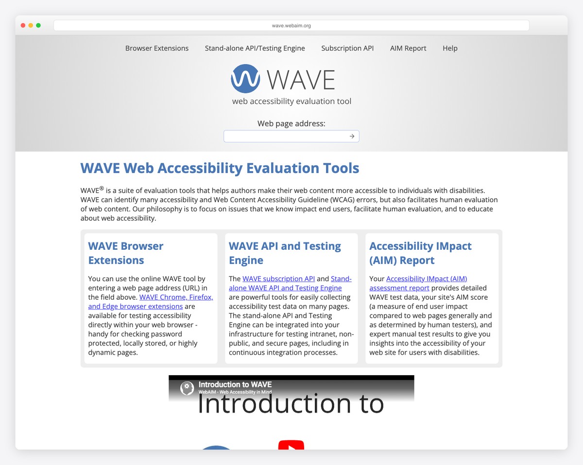
- WAVE (wave.webaim.org) — Free browser-based tool that visually flags accessibility issues on any web page
- axe DevTools (browser extension) — Developer-oriented tool that identifies WCAG violations with specific fix recommendations
- Lighthouse (built into Chrome) — Google’s audit tool includes an accessibility score with actionable items
- WebAIM Contrast Checker — Tests color combinations against WCAG contrast requirements
- VoiceOver (Mac/iOS) or NVDA (Windows) — Screen readers for real-world testing
Run the WAVE tool on your church homepage as a starting point. It will identify specific issues — missing alt text, contrast failures, missing form labels — with visual markers showing exactly where each problem is.
Accessibility Checklist for Church Websites
- All images have descriptive alt text
- Color contrast meets 4.5:1 ratio for text
- Links have descriptive text (no “click here”)
- Headings follow logical hierarchy (H1 → H2 → H3)
- Videos have captions
- Site is navigable by keyboard only
- Form fields have visible labels
- Information isn’t conveyed by color alone
- PDFs are digital (not scanned) and tagged
- Skip navigation link is present
- Focus indicators are visible
- No auto-playing audio or video
Frequently Asked Questions
Are churches legally required to have accessible websites?
Religious organizations are generally exempt from ADA Title III requirements. However, the legal landscape is evolving, and exemptions don’t apply to all church-operated programs. More importantly, accessibility is a values question for churches, not just a legal one. Your church likely strives to welcome everyone — your website should reflect that commitment.
How much does it cost to make a church website accessible?
Most accessibility improvements cost nothing beyond time. Adding alt text, fixing heading structure, improving link text, and testing with keyboard navigation are all free. If your site needs significant structural changes, those costs depend on your platform. For a site that’s already well-built, achieving good accessibility might take 4-8 hours of focused work. Factor this into your website maintenance routine.
Do accessibility overlays work?
Accessibility overlays (widgets that add a floating button with accessibility options) are widely criticized by accessibility experts. They don’t fix underlying code issues, can interfere with assistive technology, and create a false sense of compliance. Don’t rely on an overlay. Fix the actual accessibility issues in your website’s content and structure instead.
How do we handle sermon audio accessibility?
Sermon audio should have a transcript available for deaf users. Full transcription of every sermon is ideal but time-consuming. At minimum, provide sermon notes or an outline alongside the audio. Some churches use AI transcription services (like Otter.ai) to generate rough transcripts that a volunteer can quickly clean up. This also helps with SEO — search engines can index text but not audio.
Should we add an accessibility statement to our website?
Yes. An accessibility statement shows that your church takes the issue seriously. Include: your commitment to accessibility, the standard you’re working toward (WCAG 2.2 AA), known limitations, and a contact method for people who encounter barriers. Place it in your footer alongside your privacy policy. It takes 15 minutes to write and demonstrates genuine care for all visitors.
Leave a Reply