Your church’s brand isn’t a logo. It’s the complete visual and emotional experience people have when they encounter your church — online, in print, on social media, and in person. A strong brand communicates professionalism, intentionality, and identity. A weak or inconsistent brand communicates confusion, disorganization, or “we haven’t thought about this.”
Your brand underpins all of your marketing. For the bigger picture, see our church marketing guide.
The good news: church branding doesn’t require a $10,000 agency. With a clear logo, a defined color palette, two fonts, and a one-page brand guide, your church can present a cohesive identity across your website, social media, print materials, and signage. This guide walks through each element step by step.
In This Guide
Logo: Your Visual Foundation
Your logo appears on everything — website header, social media profiles, bulletins, business cards, signage, merchandise. Get this right, and every other branding decision gets easier.
Keep It Simple
The best church logos are simple enough to be recognized at small sizes (like a social media profile picture) and large sizes (like a building sign). Think of a clean wordmark (your church name in a distinctive font), a simple icon alongside the name, or an abstract mark. Avoid logos with excessive detail, gradients, or realistic illustrations — they don’t scale well and look dated quickly.
Avoid Cliches
Crosses, doves, flames, open Bibles, and steeples are the default church logo elements — which means they’re also the least distinctive. Your logo doesn’t need to literally depict a church symbol to communicate that you’re a church. Many of the most recognizable church brands use wordmarks or abstract marks that don’t include any religious imagery. Your church name already communicates what you are.
That said, if a cross or other symbol is genuinely meaningful to your church’s identity, use it — but design it in a fresh, contemporary way rather than a clip-art style.
Get It in Vector Format
Your logo must exist as a vector file (SVG, AI, or EPS) — not just a JPG or PNG. Vector files scale to any size without losing quality. You’ll need your logo at tiny sizes (favicon, social media) and huge sizes (banners, signage). Without a vector file, you’ll get blurry logos at large sizes.
You also need your logo in multiple versions: full color, white (for dark backgrounds), and black (for one-color printing).
Budget Options for Logo Design
- Professional designer ($500-2,000): The best option if budget allows. You get a custom logo, vector files, multiple variations, and a designer who understands your vision.
- 99designs or Fiverr ($50-300): Crowdsourced or freelance design. Quality varies, but you can find solid work. Provide clear direction and examples of logos you like.
- Canva or Looka ($0-50): AI-assisted logo generators. Good for a starting point, but the results can feel generic. Better than nothing, but not a long-term solution for a church that values design.
- Talented church member ($0): If someone in your congregation is a professional graphic designer, ask if they’d donate their skills. This produces the best results at no cost — but only if they’re genuinely skilled. Your cousin who “knows Photoshop” is not the same as a professional designer.
Color Palette: 3-4 Colors Maximum
A defined color palette creates visual consistency across every touchpoint — website, social media graphics, printed bulletins, signage, and slides. Choose 3-4 colors and use them everywhere.
How to Choose Colors
Start with one primary color that defines your brand. Then select 1-2 secondary colors that complement it, and one neutral (usually dark gray or charcoal for text). Consider what your colors communicate:
- Blue — Trust, stability, calm. Common for traditional and established churches.
- Green — Growth, renewal, nature. Works well for churches with an environmental or community focus.
- Orange/Yellow — Energy, warmth, welcome. Popular with contemporary and community-focused churches.
- Purple — Creativity, depth, liturgical tradition. Common for churches in liturgical traditions.
- Teal/Coral — Modern, fresh, distinctive. Popular with church plants and contemporary churches.
- Black + White — Minimalist, bold, contemporary. Works for churches with a design-forward identity.
Document Your Exact Colors
Colors need to be documented as specific codes — not just “blue.” Record the hex code (e.g., #2B5797) for web use, RGB values for screen display, and CMYK values for print. This ensures your blue is the same blue on your website, your business cards, and your social media graphics. Eyeballing it creates inconsistency.
Fonts: Two Maximum
Two fonts cover everything your church needs: a heading font and a body font. More than two creates visual chaos. Less than two can work (one font in different weights) but limits variety.
Heading Font
Your heading font has personality. It’s used for page titles, section headers, sermon series titles, and slide headers. It can be bold, distinctive, or stylized — but still readable. Popular Google Fonts choices for church headings:
- Montserrat — Clean, modern, versatile. Works for any church style.
- Playfair Display — Elegant, traditional, serif. Good for liturgical or established churches.
- Raleway — Light, contemporary, minimal. Works for modern church plants.
- Oswald — Bold, condensed, impactful. Good for churches with a strong, direct identity.
Body Font
Your body font is used for all paragraph text — website content, bulletin text, email content. It should be highly readable at small sizes, work well on screens and in print, and be visually neutral (it shouldn’t distract from the content). Popular choices:
- Open Sans — The most readable web font. Safe, clean, professional.
- Lato — Warm, friendly, highly legible. Slightly more personality than Open Sans.
- Source Sans Pro — Clean, modern, designed for screen readability.
- Merriweather — Serif option for churches wanting a more traditional feel. Excellent screen readability for a serif font.
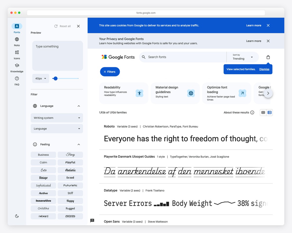
All of these are free through Google Fonts and available on every major website builder platform.
Applying Your Brand to Your Website
Once you have your logo, colors, and fonts defined, applying them to your church website is straightforward on any platform:
- Upload your logo to the header/navigation area
- Set your colors in the site-wide style settings (primary color for buttons and links, secondary for accents, neutral for text)
- Set your fonts in the typography settings (heading font for all headings, body font for all paragraph text)
- Use your brand colors in any custom graphics, section backgrounds, or buttons
- Maintain consistency — don’t introduce new colors or fonts on individual pages
Platforms like Squarespace and Tithe.ly make this especially easy with global style settings that cascade across every page. WordPress themes handle it through the Customizer. For more on website setup, see our website building guide.
Creating Your One-Page Brand Guide
A brand guide ensures everyone who creates content for your church — website, social media, bulletins, slides, signage — uses the same visual elements. It doesn’t need to be a 30-page document. One page is enough.
Your one-page brand guide should include:
- Logo — Primary version, white version, minimum size. Note: don’t stretch, rotate, or add effects to the logo.
- Color palette — Each color with its hex code, RGB, and CMYK values
- Fonts — Heading font name and body font name, with usage guidance (heading vs. body)
- Photography style — Brief description: “Warm, candid, real people. No stock photos. Natural lighting preferred.”
- Tone of voice — Brief description: “Friendly, warm, clear. Avoid jargon. Write for visitors, not insiders.”
Create this in Canva (free) or Google Docs and share it with anyone who creates content for your church. Update it whenever brand elements change. This single document prevents the slow drift toward inconsistency that happens in every organization without brand guidelines.
Frequently Asked Questions
How much should a church spend on branding?
A professional logo and basic brand guide: $500-2,000. A comprehensive brand identity (logo, extended color system, custom illustrations, brand photography, detailed guidelines): $2,000-10,000. A DIY approach with Canva and Google Fonts: $0-50. Any investment above zero is better than none — even a simple, consistently applied brand looks more professional than random, inconsistent design choices.
Should we rebrand or just refresh our current brand?
If your current logo is clipart-quality, uses dated design trends (heavy drop shadows, beveling, busy gradients), or no longer represents who your church is, a rebrand is worth it. If your logo is clean and recognizable but your colors/fonts are inconsistent, a brand refresh (defining your palette and fonts while keeping the logo) is sufficient. Don’t rebrand just because you’re bored — brand recognition has value.
Can we use the same brand across our website and social media?
You should. Consistency across platforms is the entire point of branding. Use the same logo, colors, and fonts on your website, Instagram, Facebook, YouTube, printed materials, and presentation slides. When someone sees your Instagram post and then visits your website, the visual connection should be immediate. For social media-specific advice, see our social media strategy guide.
What if we can’t afford a professional designer?
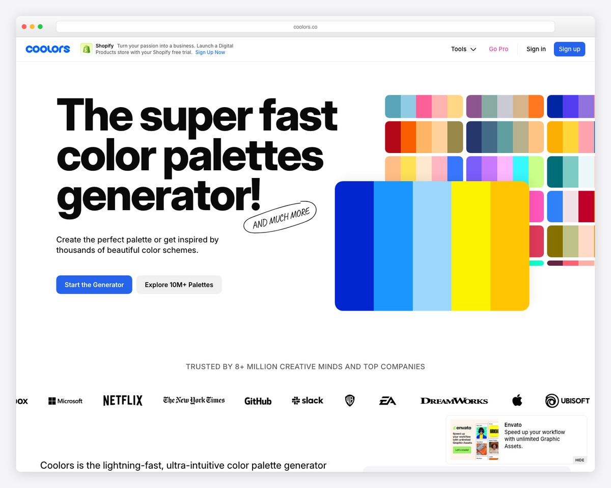
Use Canva’s logo maker for a basic logo, choose 3 colors using Coolors.co (a free color palette generator), select two Google Fonts that pair well, and create your one-page brand guide in Google Docs. This DIY approach produces a consistent, intentional brand at zero cost. It won’t match what a professional designer creates, but it’s vastly better than no brand guidelines at all.
How does branding affect our website design?
Your brand defines your website’s visual identity. When your colors, fonts, and logo are clearly defined before you start building, the website design process is faster and more cohesive. Every design decision — button colors, heading styles, image treatment — is guided by your brand. Without branding, you end up making ad hoc design decisions that create an inconsistent, unprofessional look. Define your brand first, then build your website. See our design trends guide for current style direction.
Leave a Reply