Church Website Features
Your church believes life is better in community — so why does your small groups page so often fail to get anyone into a group? Usually it’s not the groups; it’s the page. A buried PDF, a stale list of names, or a single generic contact form quietly loses the very people who were ready to take a step. This guide shows you how to build a small groups page that actually fills groups — the finder, the cards, the sign-up flow, and the mistakes to avoid — whatever platform you’re on.
Before the how-to, here’s the anatomy of a page that converts browsers into members:
When someone lands on your groups page, they’re really asking one question: “Is there a group for someone like me?” How quickly you answer it decides whether they join. There are four common patterns, from best to worst.
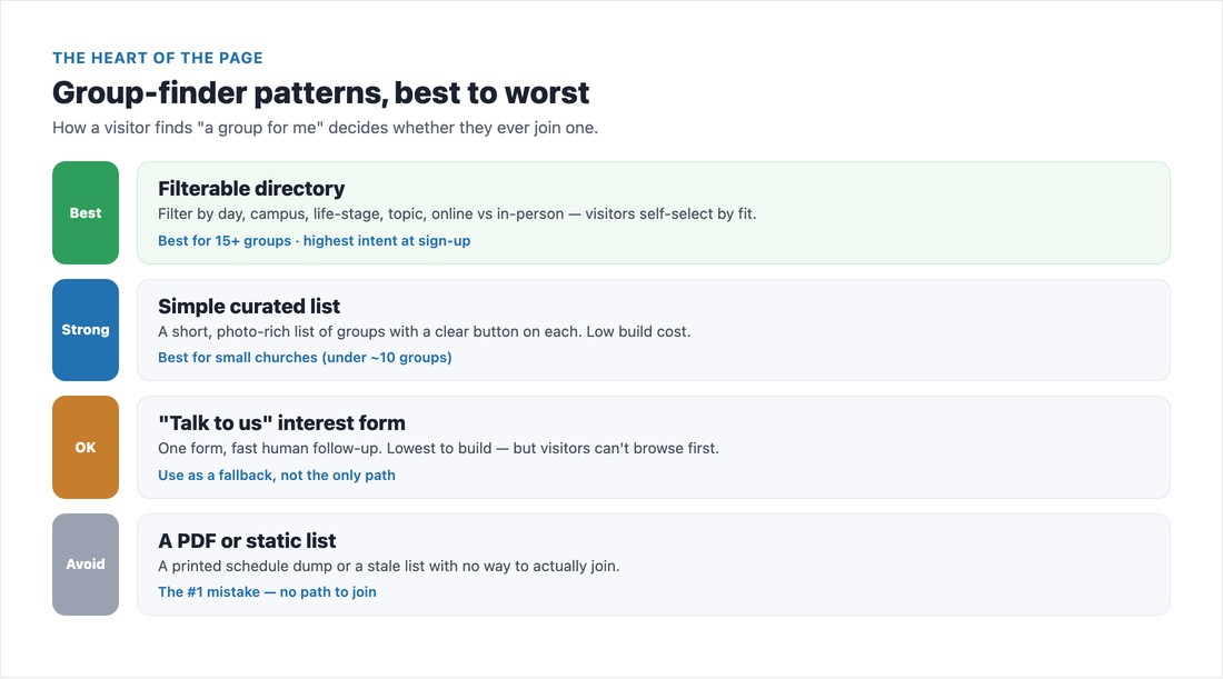
A filterable directory is best once you have more than a dozen groups — let people filter by day of the week, campus or location, life stage, topic, and online vs. in-person, so they self-select by fit. A simple curated list (short and photo-rich, with a button on each group) is perfect for a small church with under ten groups. A “talk to us” interest form is the lowest-effort to build but the highest-friction to join — use it as a fallback, not your only path, and only if you follow up fast. The pattern to avoid entirely is a PDF or a static, un-joinable list — that’s the number-one reason small groups pages fail.
A warning on the filterable directory: a powerful filter sitting on top of an empty or broken backend is worse than a simple list. If you build filters, keep the group data current — which is exactly what the ChMS sync below is for.
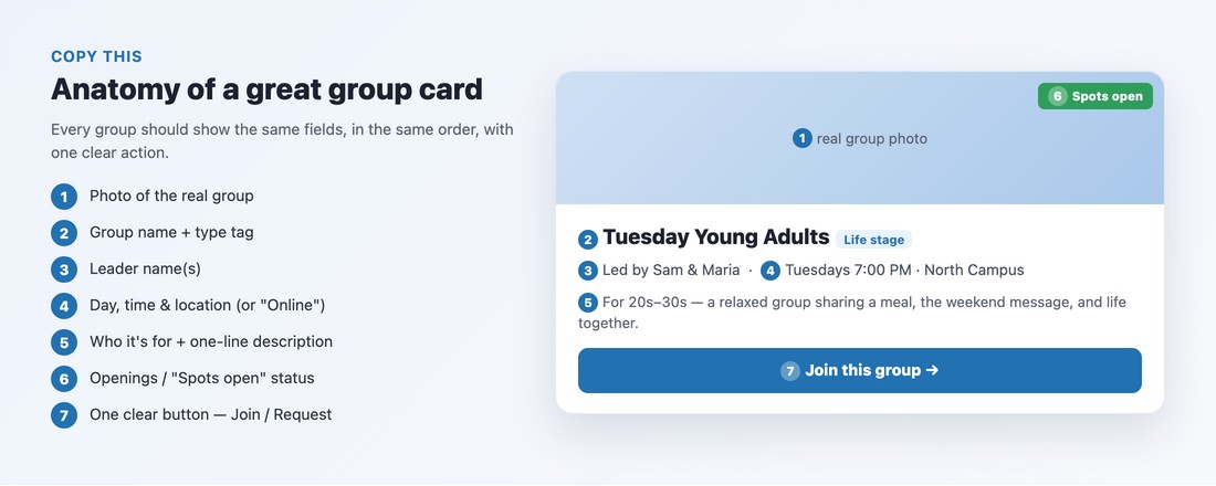
Every group should appear as a card with the same fields, in the same order, so visitors can scan and compare. Include: a real photo of the group, the group name plus a type tag, the leader’s name(s), the day, time, and location (or “Online”), who it’s for and a one-line description, an openings/capacity status so people know they can still join, and one clear button — “Join this group” or “Request to join.” Resist the urge to cram in more; a clean, consistent card beats a dense one every time.
The flow that converts is simple: browse → pick a group → express interest → the leader reaches out. Crucially, let people browse before any login or account is required, and capture only what you need — name, email, phone. A great mental model, borrowed from the best church platforms, is three group types:
After someone signs up, show a confirmation and a “here’s what happens next” message, and make sure the group leader is notified to make first contact within a day or two. The fastest way to kill momentum is silence after a sign-up.
If you maintain your group list by hand, it goes stale by the next semester. Instead, let your church management system be the single source of truth and feed the website finder. Planning Center Groups publishes a filterable, embeddable directory (with open-enrollment, request-to-join, and closed types) you can drop onto Squarespace or WordPress; Tithe.ly and Subsplash both include built-in group finders with sign-up and in-app messaging. Update the group in your ChMS once, and the page updates itself — no more “0 groups found.”
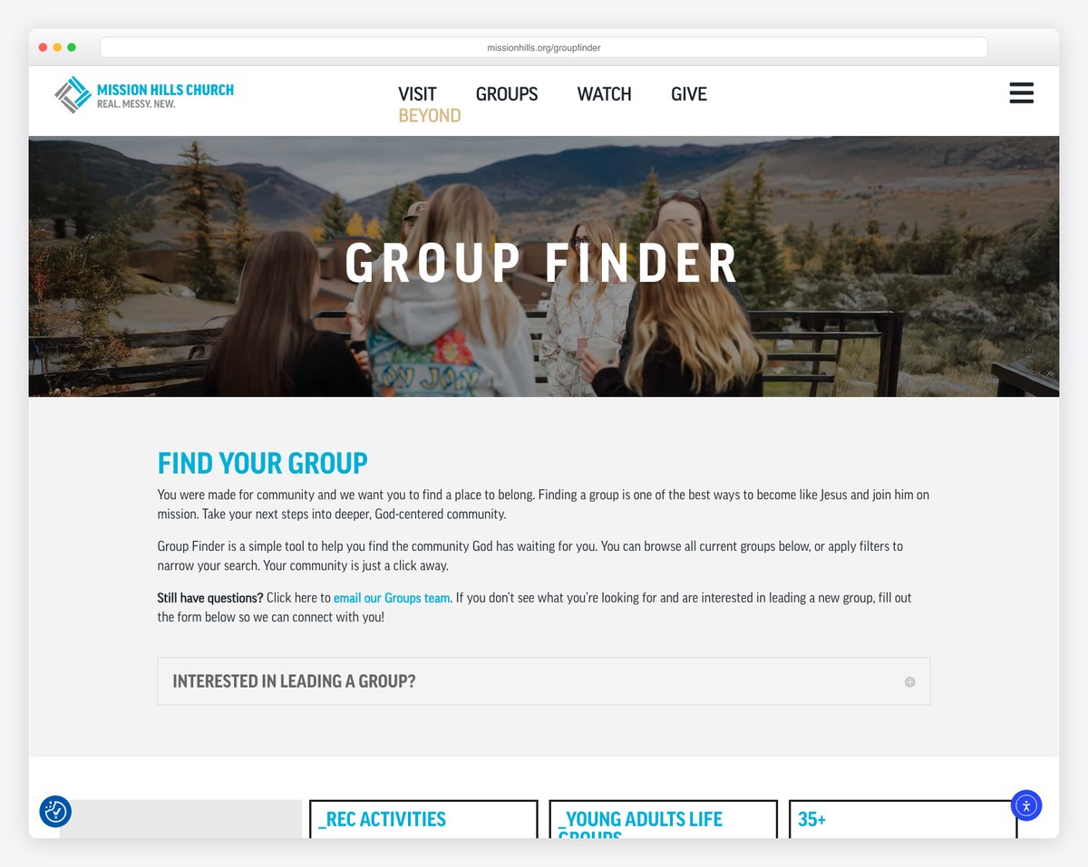
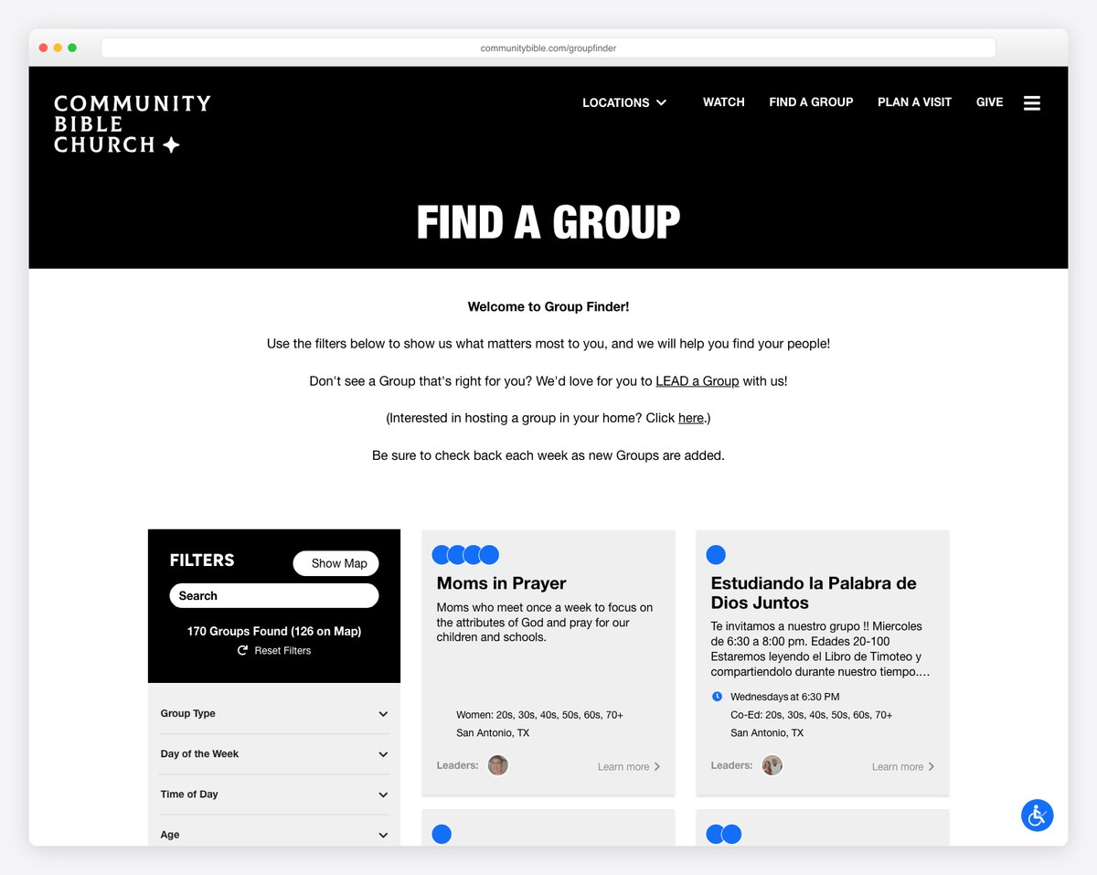
A few churches do this exceptionally well. Mission Hills Church (missionhills.org/groupfinder) runs a clean filterable finder with leader, day, location, and a “more info” detail page per group — the model to emulate. Community Bible Church (communitybible.com/groupfinder) has the best filter breadth, including language, kid-friendly, and accessibility toggles. NewSpring and Eagle Brook show how to keep it simple at scale. Study what they do, then borrow the patterns that fit your size.
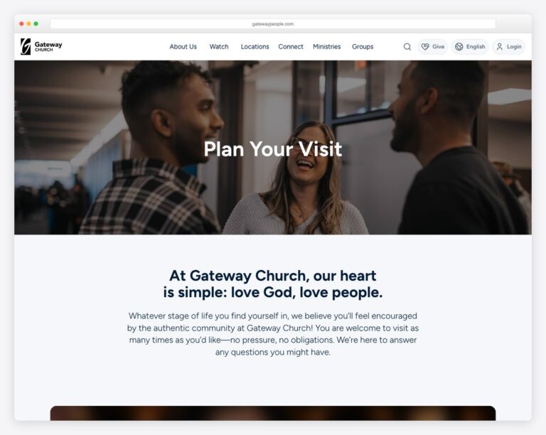
The small groups page is the natural next step after someone’s first visit — pair it with a strong plan your visit page, and make sure both are on your list of essential church website features. For more inspiration, browse our roundup of the best church website designs.
📄 Free download: The Small Groups Page Checklist (PDF) — the page, the finder filters, the group-card fields, and the sign-up flow on one printable page.
A small groups page isn’t a brochure — it’s a doorway. Make the finder effortless, give every group a clean card with one clear button, let people join in a couple of taps, and keep the data fresh from your ChMS. Do that, and the page stops being a dead end and starts doing what your church actually wants: getting people connected.
A short “why join” intro, a group finder (ideally filterable by day, location, life stage, topic, and online vs in-person), consistent group cards showing the leader, time, place, who it’s for, openings, and one clear button, a simple express-interest sign-up, real photos of real groups, a short FAQ, and a mobile-first layout.
The best flow lets visitors browse groups without logging in, pick one, and express interest with just their name, email, and phone — then the group leader reaches out within a day or two. Many church platforms use three group types: Open (join instantly), Request to Join (leader approves), and Closed (not currently accepting members).
Having no clear way to actually join — a printed PDF schedule, a stale list of group names with no sign-up button, or a single generic contact form with no group context. A close second is building a fancy filterable finder on top of an empty or out-of-date group database.
Planning Center Groups, Tithe.ly, and Subsplash all offer group directories and sign-up tools, and larger churches use Church Community Builder, Church Teams, or Rock RMS. The key is to let your church management system be the single source of truth and feed your website’s group finder, so the data never goes stale.

Church Website Features
Church Website Features
Church Website Features
10 complete church website templates, MIT licensed. Browse every demo freely; we will email you whichever folder you want.
All templates