A “Plan Your Visit” page is the one page on your church website built entirely for the person who has never walked through your doors — it answers the practical and emotional questions a first-time guest has before Sunday, in one place, so showing up feels less like a risk. It is the digital version of the friendly volunteer who meets a nervous visitor in the parking lot, points them to the coffee, and walks their kids to check-in.
Most churches either bury this information across five different menu items or skip it entirely. That is a missed opportunity: the people most likely to visit your church this weekend are the ones quietly reading your website on Saturday night, trying to figure out what time the service starts, where to park, and what to do with their four-year-old. This guide breaks down exactly what a great Plan Your Visit page includes, shows you 10 real church examples (with screenshots and what each one does well), walks you through building your own, and gives you a fill-in-the-blank template you can copy today.
In This Guide
What Every Plan Your Visit Page Needs
After reviewing dozens of church Plan Your Visit pages, the same building blocks show up on every effective one. Think of this as the checklist a first-time guest is mentally running through — answer all of it and you have removed almost every reason to hesitate.
- Service times and length. List every service, and tell people how long it runs. “Services last about 70 minutes” does more to calm a newcomer than any amount of welcome copy.
- Address, map, and parking. An embedded map plus specific parking instructions — which lot, where guest parking is, and which door to walk toward.
- What to expect on Sunday. A short walkthrough of the service: the music, the message length, whether people raise hands or sit quietly, what happens after.
- Kids and check-in. Age ranges, the check-in process, and your safety/security measures. Parents will not come if this is vague.
- What to wear. Almost always “come as you are,” but say it — it is one of the top unspoken questions.
- One clear next step. A single primary call to action: a short “Plan Your Visit” or connection form that lets them tell you they’re coming, so a real person can follow up.
- Real photos. Your actual building, lobby, and people — not stock images. Visitors are trying to picture themselves there.
- A warm, low-pressure welcome. A sentence or two that names the awkwardness (“visiting a new church can feel intimidating”) and promises no pressure.
- A short FAQ. The five or six questions guests actually ask, answered plainly.
- Accessibility details. Wheelchair access, hearing assistance, ASL or translation, and any sensory or special-needs support.
- A follow-up promise. Tell them what happens after they fill out the form — “we’ll text you directions and find you on Sunday.”
You don’t need all eleven in a giant wall of text. The best pages lead with times, location, and a single CTA, then let visitors scroll for the reassurance details. For the bigger picture of how this page fits with the rest of your site, see our guide to the essential pages every church website needs and the features every ministry site should have.
10 Real Church Plan Your Visit Pages (and What Works)
The fastest way to build a great page is to study churches that already have one. Below are ten real, live examples across denominations, church sizes, and platforms — from a 30,000-person multisite to a neighborhood Lutheran congregation. For each, here’s what they get right and what you can borrow.
1. Gateway Church — accessibility done right
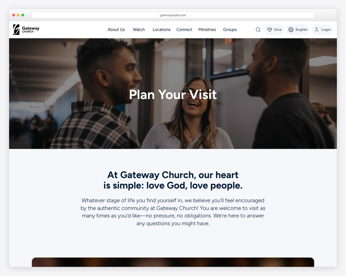
Gateway Church (a large multisite in the Dallas–Fort Worth area) opens with a “no pressure, no obligations” promise and a campus finder, then handles accessibility better than almost anyone: ASL interpretation, a Spanish simulcast, and the ability to pre-check-in kids before you arrive. If you have more than one campus or any accessibility ministries, this is the page to model.
2. Transformation Church — message-first clarity
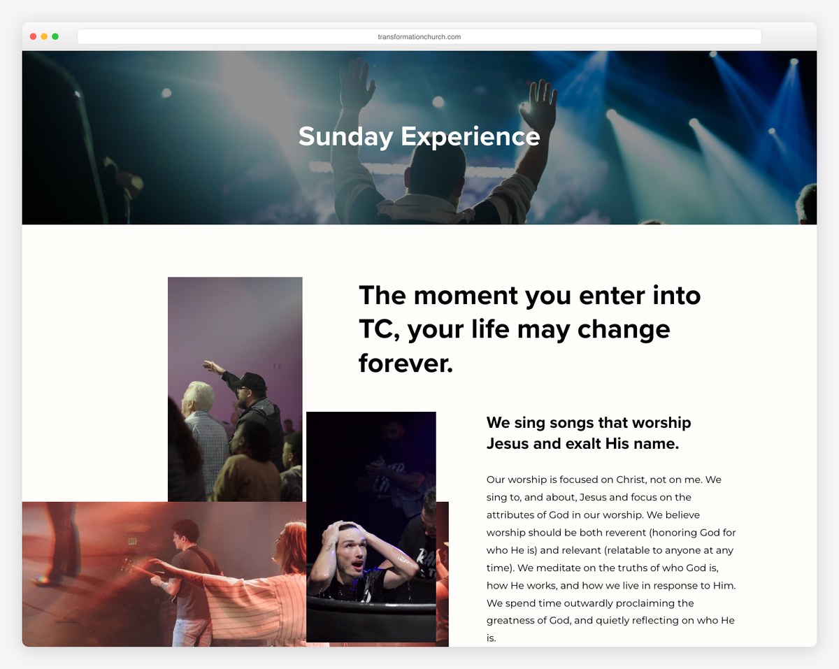
Transformation Church (Pensacola, FL, built on Squarespace) leads with three crisp value propositions and confident, aspirational copy, then breaks out clearly branded kids and students environments. It proves you can have a design-forward page without losing the practical details.
3. The Cause Church — the full visitor journey
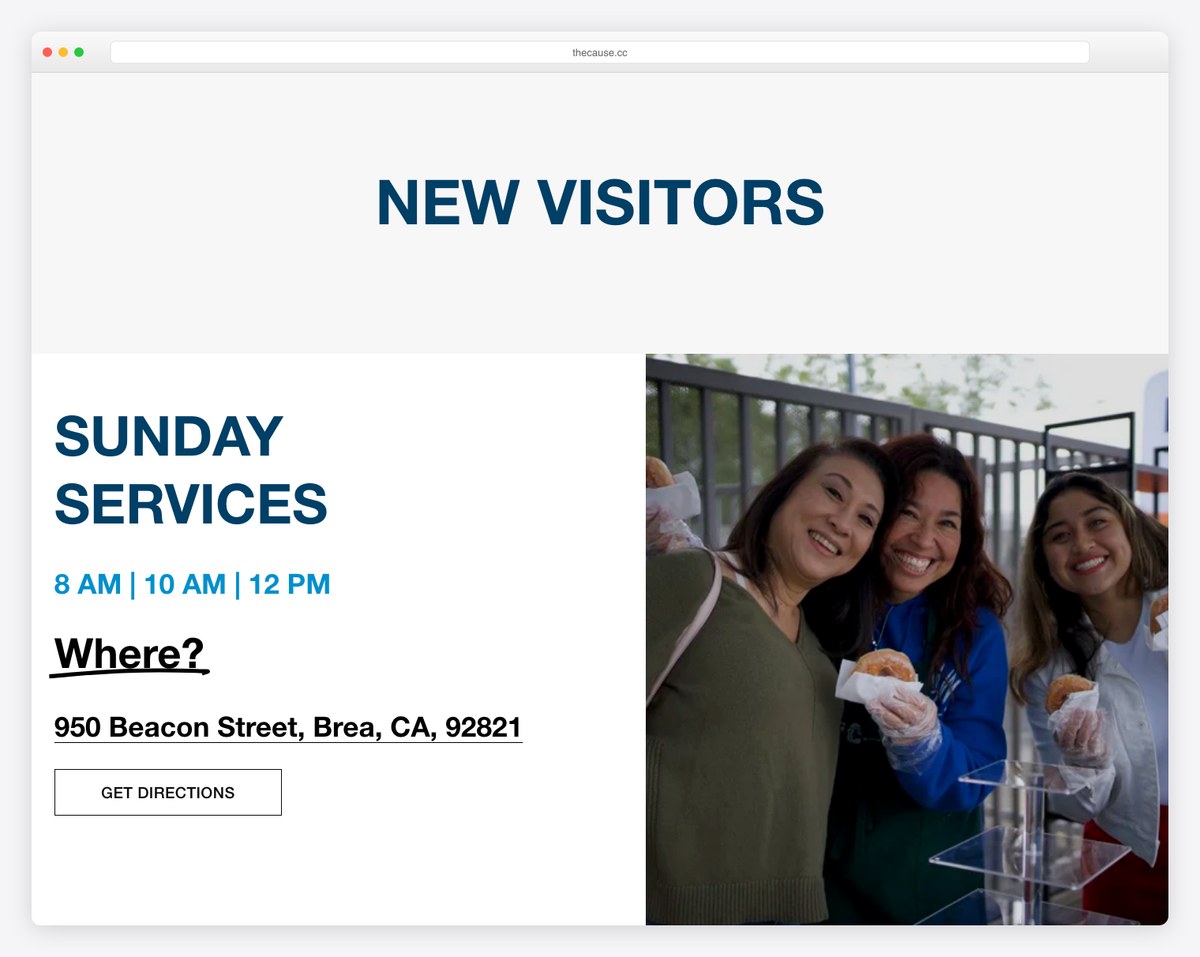
The Cause Church (Brea, CA) walks a guest through the entire arc of a visit — where to park, the coffee, the Connection Center, and exactly when kids and youth meet. It’s a clean Squarespace build that any small-to-mid church could realistically copy.
4. Elevation Church (St. Louis) — pre-empting anxiety
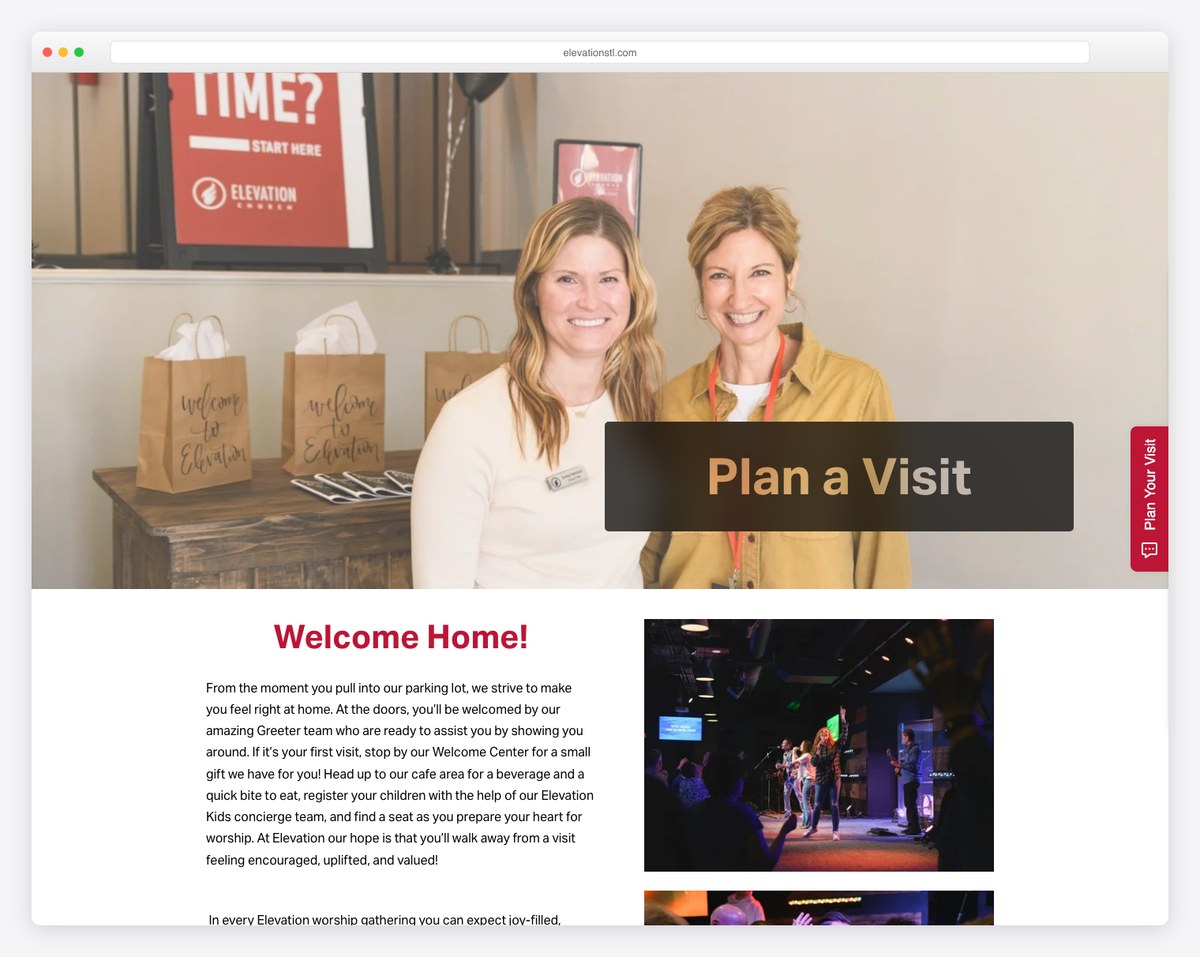
Elevation Church STL sets a clear ~70-minute expectation, uses bold high-contrast CTAs, and includes an FAQ that answers the fear questions directly — plus an online-service option for anyone not ready to show up in person. Notice how the design removes excuses one by one.
5. Lakepointe Church — multiple paths to “yes”
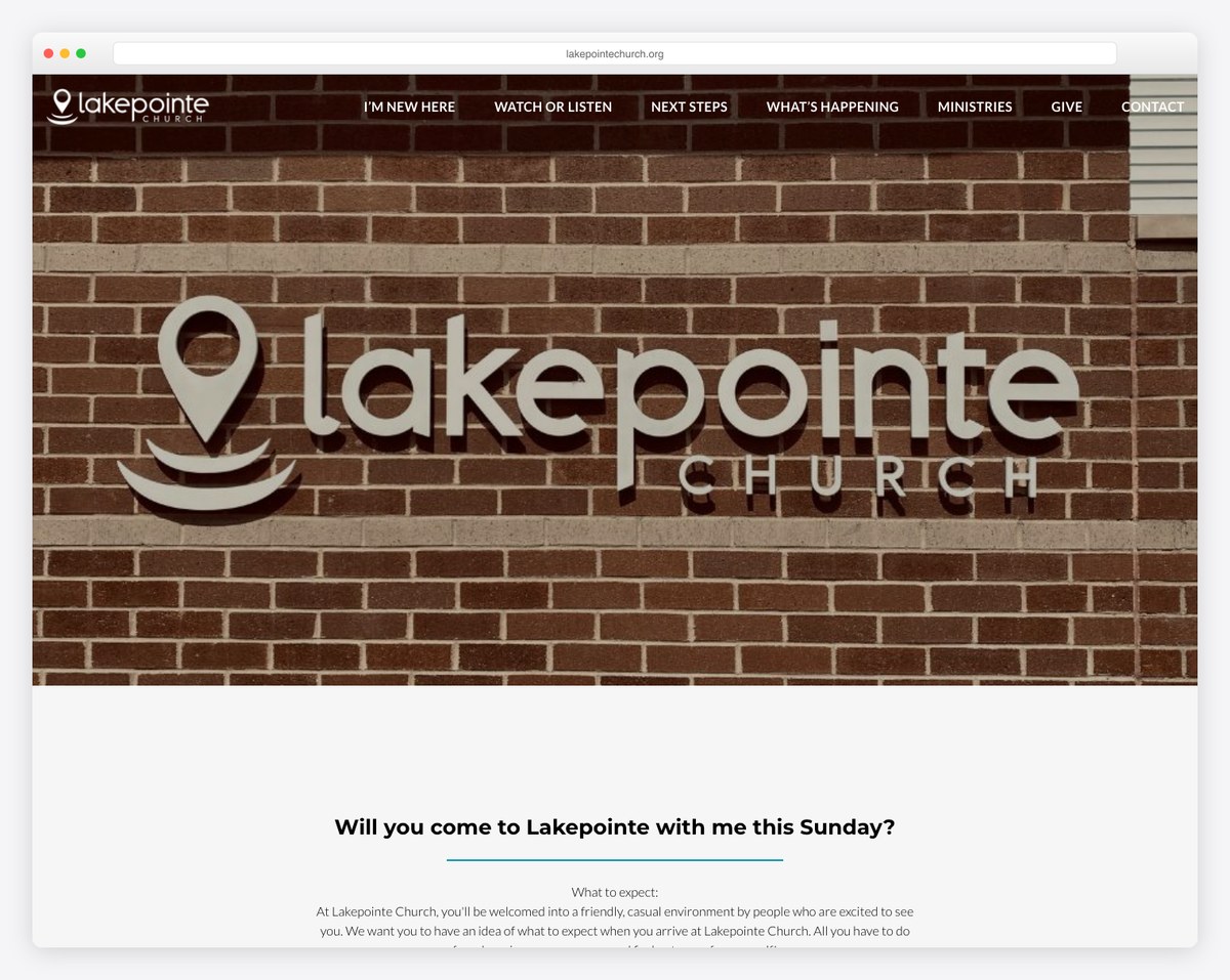
Lakepointe Church (a WordPress site) opens with “come as you are,” sets a 65-minute expectation, details four age-specific kids environments, and offers a free gift at the Welcome Center after the service. It gives several different conversion paths without feeling cluttered.
6. Rocky Creek Church — the step-by-step arrival
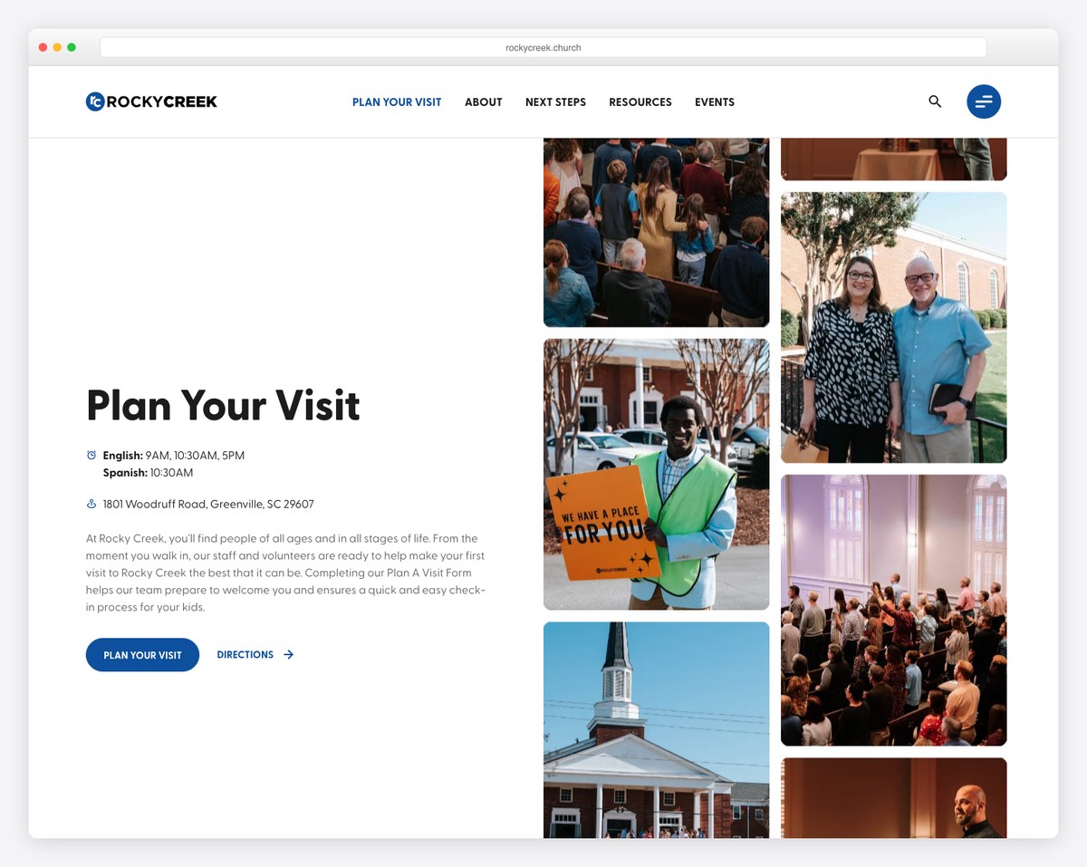
Rocky Creek Church (Greenville, SC, on Webflow) maps the visit as numbered steps — parking, the Welcome Center, finding a seat — and spells out its secure, tag-matching kids check-in. This page ranks on Google’s first page on its own merits, which tells you the “real, specific walkthrough” format works.
7. Bethel Church (Richland) — best-in-class for special needs
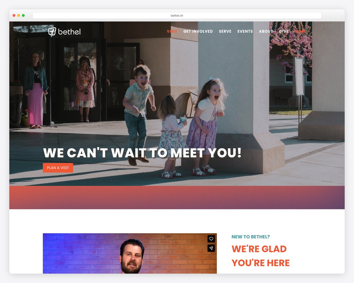
Bethel Church (Richland, WA) is the gold standard for inclusion: a sensory-friendly buddy room and clear special-needs support, alongside real photos of the actual space and a dual “New Here?” / “Plan a Visit” CTA. If your church serves families with special needs, say so here — loudly.
8. Bethel Church (Houston) — empathy-led copy for smaller churches
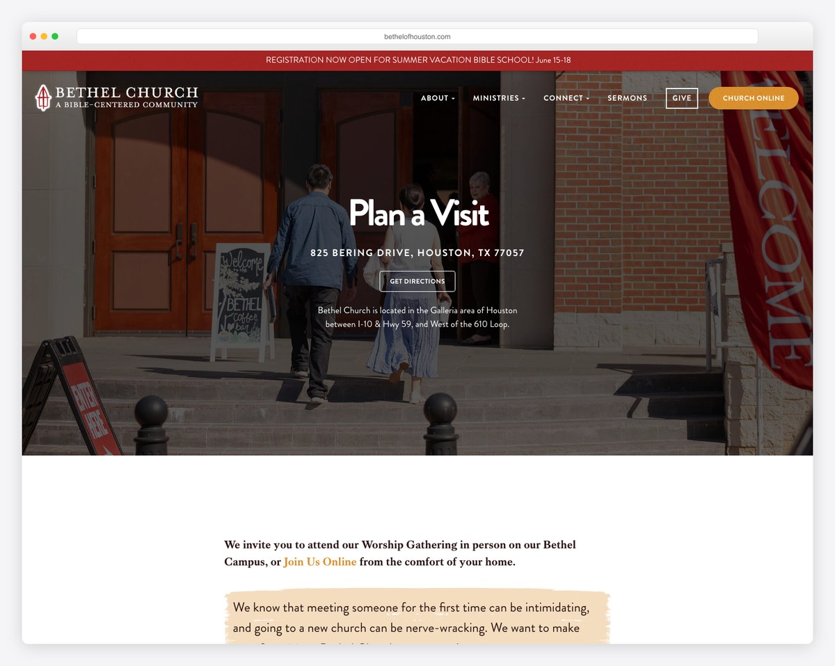
Bethel of Houston proves you don’t need a megachurch budget. Its copy names the feeling directly — “meeting someone for the first time can be intimidating” — and answers it with warmth. A great template for a small or mid-sized church on WordPress.
9. Community Lutheran Church — variety and reassurance
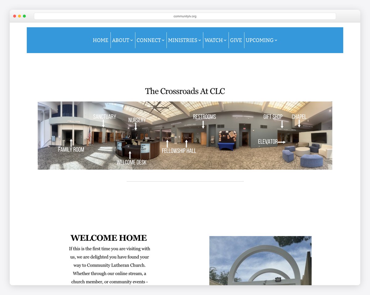
Community Lutheran Church (Las Vegas, NV) shows how a congregation with multiple worship styles can present them clearly, with thoughtful touches like nursery pagers and cry/nursing rooms and an anxiety-reducing FAQ. A strong model for liturgical and traditional churches.
10. St. Catharine of Siena — a Catholic parish done well
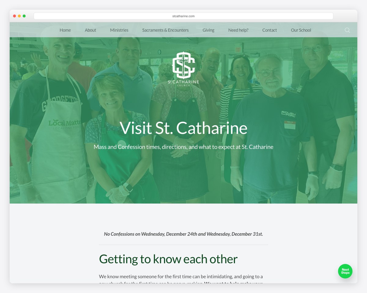
St. Catharine of Siena (Columbus, OH) is the best Catholic example we found: it explains Mass length (~60 minutes), gently walks non-Catholics through the liturgy, and covers parking and visitor registration. Liturgical churches often skip the “explain it to a newcomer” step — this parish nails it.
Want more design inspiration beyond this single page? Browse our roundup of the best church website designs for full-site examples.
How to Build Your Plan Your Visit Page, Step by Step
- Start with the visitor’s questions, not your ministries. Write down the real questions a nervous first-timer has — When does it start? Where do I park? What about my kids? — and make those the backbone of the page. Resist the urge to list every program.
- Lead with the essentials above the fold. Service times, address with a map, and one clear CTA should be visible without scrolling. Everything else is supporting detail.
- Add the “what to expect” walkthrough. Describe a typical service start to finish in a few short paragraphs or steps. Specificity (“the band plays for about 25 minutes, then a 35-minute message”) beats vague reassurance.
- Reassure parents. Give kids’ age ranges, the check-in flow, and your security process. Add a photo of the kids’ space if you can.
- Make one CTA the obvious choice. A short form (“Plan Your Visit” or a connection card) collecting name, email or phone, and which service they’re coming to. Keep it to three or four fields. See our homepage formula for how this CTA should also appear on your front page.
- Close the loop with follow-up. Tell them what happens next, and actually do it — a text with directions, a name to look for, a free gift at the Welcome Center.
- Add real photos and an FAQ. Swap any stock imagery for photos of your building and people, and answer the five or six questions guests ask most.
- Test it on a phone. Most guests will read this on mobile Saturday night. Open it on your own phone and try to find the service time in five seconds.
Adding a Plan Your Visit Page on Your Platform
Every major church website platform can host a Plan Your Visit page — the difference is how much is built for you. Here’s the quick version by platform, with links to our full reviews.
| Platform | How you build it | Best for |
|---|---|---|
| WordPress | Add a new page, build with blocks or your theme’s page builder, embed a form plugin and a map | Full control and SEO; see WordPress for churches |
| Squarespace | Add a page, drop in section blocks, use a built-in form and map block | Design-forward DIY; see Squarespace for churches |
| Wix | Add a page, drag in sections, use the built-in form and Google Maps elements | Drag-and-drop ease; see Wix for churches |
| Webflow | Build a custom page with full design control and a native form | Designers wanting pixel control; see Webflow for churches |
| Tithe.ly Sites | Use the built-in connection card and giving tools on a dedicated visit page | All-in-one church tools; see Tithe.ly Sites review |
| Subsplash / Nucleus | Embedded forms and next-step launchers designed for guest follow-up | Engagement-focused churches; see Subsplash and Nucleus |
Copy-and-Paste Plan Your Visit Page Template
Here’s a fill-in-the-blank skeleton you can paste into your page and adapt. Replace the bracketed parts with your details and delete anything that doesn’t apply.
Hero / welcome line: “Planning to visit [Church Name]? We’d love to meet you. Here’s everything you need to know before Sunday — no pressure, no obligation.”
Service times: “We meet every Sunday at [time] and [time] at [address]. Services last about [length] minutes.”
What to expect: “When you arrive, [parking instructions]. A volunteer at [the Welcome Center / the main doors] will help you find your way. Our service includes [music style] and a [length]-minute message. You’ll fit right in whether you [come as you are / dress up / wear jeans].”
For your kids: “We have a safe, fun environment for kids from [age] to [age]. Check-in opens [time] at [location], and we use a secure tag system so only you can pick up your child.”
What to wear: “Come as you are. You’ll see everything from jeans to button-downs — wear whatever is comfortable.”
Primary CTA: “Let us know you’re coming and we’ll have someone ready to greet you. [Plan Your Visit form button]”
Follow-up promise: “After you fill this out, we’ll send you directions and a few details, and we’ll look for you on Sunday.”
For help writing the rest of your site in this same warm, clear voice, see our guide on writing church website copy that converts.
Mobile, Accessibility & SEO (the Parts Most Pages Miss)
Design for the phone first
The overwhelming majority of first-time guests read this page on a phone, often the night before. That means your service time, address, and CTA need to be reachable in a thumb-flick — not buried under a full-screen video that takes ten seconds to scroll past. Test the page on an actual phone and time how long it takes to find when the service starts.
Make it genuinely accessible
Accessibility is both the right thing to do and a real differentiator — almost no church Plan Your Visit page mentions it. Note wheelchair-accessible entrances and restrooms, hearing-assistance or ASL options, large-print or translated materials, and any sensory or special-needs ministry. Families who need these details rarely ask twice; if your page is silent, they assume the answer is no. For the full picture, see our church website accessibility guide.
Help people find the page
A great page no one can find doesn’t convert anyone. Use a clear URL (yoursite.com/visit or /plan-your-visit), put a “Plan Your Visit” or “I’m New” button in your main navigation and on your homepage, and write a page title and description aimed at searches like “[your town] church service times.” Our church website SEO guide covers how to rank for the local searches that actually bring guests through the door.
Mistakes to Avoid
- Burying the service time. If a guest has to hunt for when you meet, you’ve already lost some of them. Put it near the top.
- No map or vague directions. “On Main Street” isn’t enough. Embed a map and name the parking lot and entrance.
- Stock photos of strangers. Visitors can spot stock imagery instantly, and it quietly signals you’re hiding what the real thing looks like.
- Too many competing CTAs. “Give,” “Watch,” “Join a group,” and “Plan a visit” all shouting at once means none of them win. Pick one primary action for this page.
- Vague kids information. “We have a great kids ministry” reassures no one. Parents want ages, check-in, and security specifics.
- Collecting a form but never following up. The fastest way to waste a guest’s trust is to ask them to “plan a visit” and then go silent.
- A dead or hidden “I’m New” link. Check that the button in your nav actually points here — broken first-impression links are more common than you’d think.
Score Your Current Page
Pull up your existing Plan Your Visit page (or your homepage, if you don’t have one yet) and give yourself a point for each item below. Anything under 9 out of 12 means there’s an easy win waiting.
- Service times and length are visible without scrolling
- Address plus an embedded map and parking instructions
- A clear “what to expect” walkthrough of the service
- Kids’ ages, check-in process, and security covered
- “What to wear” is answered
- One obvious primary CTA (a short visit/connection form)
- Real photos of your building and people
- A warm, low-pressure welcome message
- A short FAQ answering common guest questions
- Accessibility details
- A stated follow-up promise (and you keep it)
- The whole page works well on a phone
When you’re ready to look beyond this one page, our guide to improving your church website and the complete church website build guide cover the rest of the site.
Frequently Asked Questions
What should be on a church Plan Your Visit page?
At a minimum: service times and how long the service lasts, your address with a map and parking instructions, what to expect during the service, kids’ ages and check-in details, what to wear, real photos, a short welcome message, a brief FAQ, and one clear call to action — usually a short form that lets a guest tell you they’re coming so you can follow up.
Does my church really need a dedicated Plan Your Visit page?
Yes, if you want to reach first-time guests. The people most likely to visit are reading your website beforehand, and they want one place that answers their practical questions without digging through your menus. A dedicated page consistently converts more visitors than scattering the same details across several pages.
What do first-time church visitors want to know before they come?
Mostly practical, anxiety-reducing things: what time it starts and how long it runs, where to park and which door to use, what to do with their kids, what to wear, and what the service will actually be like. Answer those plainly and you remove most reasons to hesitate.
What should I call the page — “Plan Your Visit,” “I’m New,” or “Visit”?
Any of them work as long as it’s obvious and consistent. “Plan Your Visit” and “I’m New” are the most recognized labels for guests. Pick one for your navigation button and use a clean URL like /visit or /plan-your-visit so the page is easy to find and link to.
How long should a Plan Your Visit page be?
Long enough to answer every common question, short enough to scan. Lead with times, location, and a CTA, then let visitors scroll for the reassurance details — what to expect, kids, accessibility, and the FAQ. One well-organized page beats both a thin paragraph and an overwhelming wall of text.
How often should we update the page?
Review it any time service times, locations, or kids’ programs change, and at least once a season. Double-check it before high-traffic weekends like Christmas and Easter, when a flood of first-time guests will be reading it — and add your special service times there.
Leave a Reply