Church Website Features
The contact page is one of the most-visited pages on any church website — and one of the most neglected. Too often it’s a lonely form floating on an empty page, with no address, no map, and a prayer request that vanishes into an inbox nobody checks. Done right, your contact page reassures first-time visitors, routes every message to the right person, and even helps you show up in local search. Here’s exactly what to include, with real examples and a copy-paste schema block most churches miss.
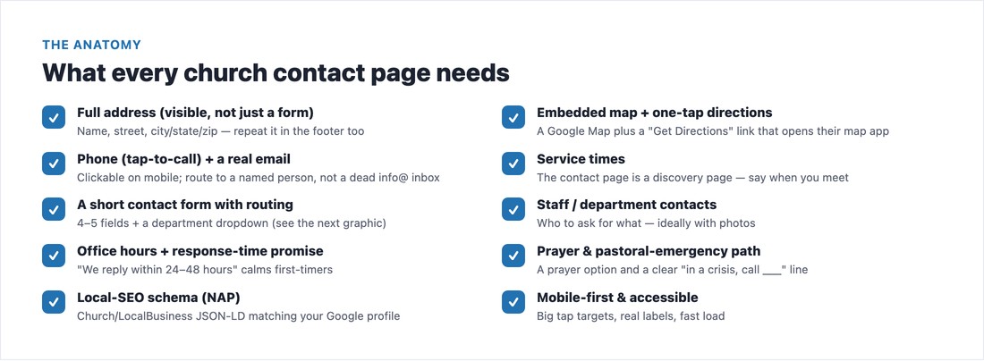
Start with the non-negotiables. The single biggest mistake is a form-only page with no visible address or phone — visitors (and search engines) need your full name, address, and a tap-to-call number right there on the page, not hidden behind a form. Add an embedded map with a “Get Directions” link, your service times (the contact page is a discovery page), a real, monitored email (not a dead info@ nobody reads), office hours, and links to actively-monitored social accounts. Everything should be mobile-first with big tap targets — most people reach your contact page on a phone.
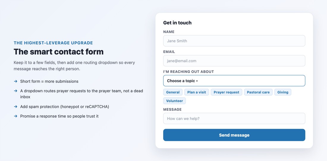
Keep the form short — name, email, message — because the longer the form, the fewer people finish it. Then add the single highest-leverage upgrade most church forms lack: a routing dropdown. Let people choose what they’re reaching out about — General, Plan a Visit, Prayer Request, Pastoral Care, Giving, Volunteer — so each message lands with the right person instead of a shared inbox. Add simple spam protection (an invisible honeypot field or reCAPTCHA), and tell people what to expect: a plain “we reply within 24–48 hours” does more to build trust than any clever copy.
Treat prayer as a first-class part of the page, not a buried checkbox. Offer a clear prayer-request option (a dedicated form or a routing choice) with a privacy selection — keep it confidential, share with the prayer team, or share publicly — and a name field so your team can pray for the person specifically. The form is the easy part; the discipline is having someone actually read and respond within a day or two. And include something almost no church website has: a clear “In a pastoral emergency, call [number]” line, so someone in crisis isn’t left filling out a web form.
Your contact page is the best place on your whole site to tell Google exactly who and where you are. Adding structured data (JSON-LD) with your name, address, phone, and hours helps your church surface in local “church near me” searches and map results — and almost no church does it. Paste a block like this into the page (most builders allow a custom-HTML or code block), editing in your real details:
<script type="application/ld+json">
{
  "@context": "https://schema.org",
  "@type": "Church",
  "name": "Your Church Name",
  "telephone": "+1-555-555-1234",
  "email": "[email protected]",
  "url": "https://yourchurch.org",
  "address": {
    "@type": "PostalAddress",
    "streetAddress": "123 Main Street",
    "addressLocality": "Your City",
    "addressRegion": "ST",
    "postalCode": "00000"
  },
  "openingHoursSpecification": [{
    "@type": "OpeningHoursSpecification",
    "dayOfWeek": "Sunday",
    "opens": "09:00", "closes": "12:00"
  }]
}
</script>
One rule that matters more than the code: your name, address, and phone (your “NAP”) must be identical everywhere — on this page, in your footer, and on your Google Business Profile. Inconsistent NAP is one of the most common things holding churches back in local search; our church website SEO guide covers the rest.
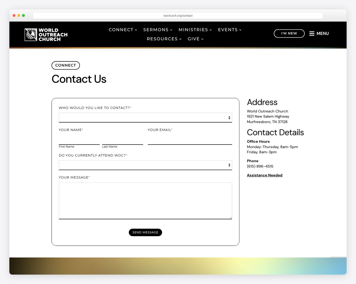
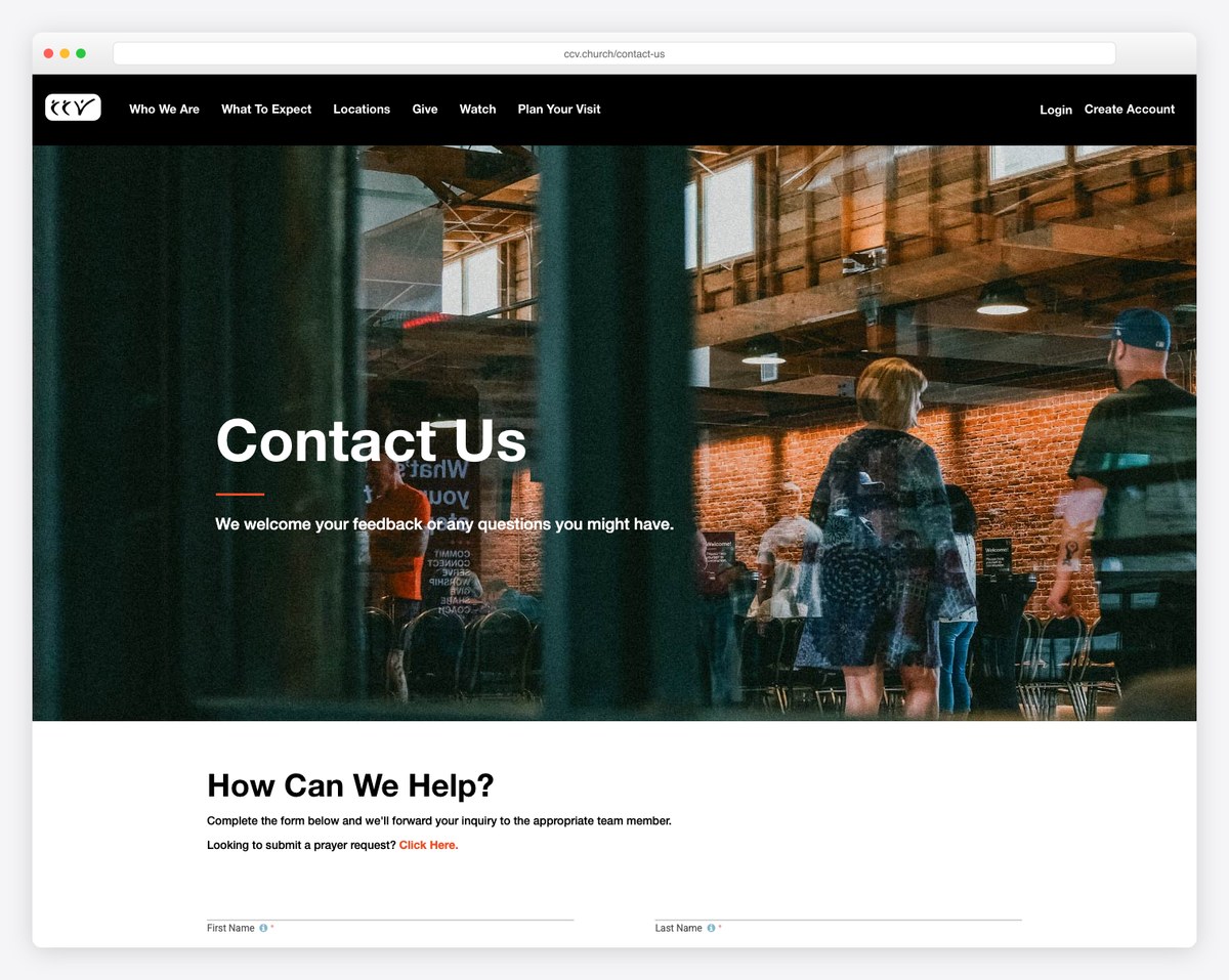
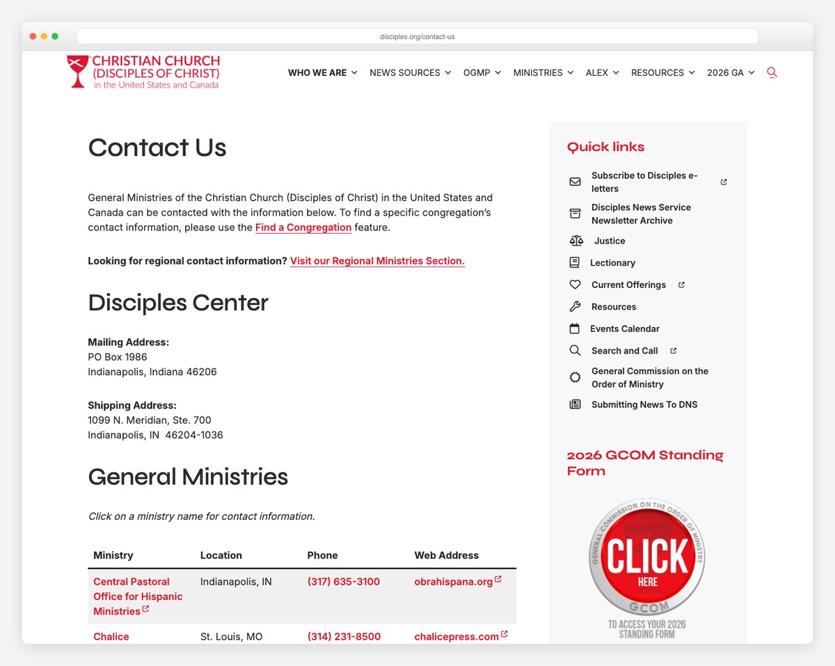
A few churches model these principles well. World Outreach Church is a NAP gold standard — full address, tap-to-call phone, explicit office hours, service times, and a prayer link all on one page. Christ’s Church of the Valley (CCV) nails routing with a topic dropdown and a separate, prominent prayer path across its many campuses. The Christian Church (Disciples of Christ) pairs a routing dropdown with spam protection and a real staff directory. Mix their strengths: visible NAP and map, a short routing form, a clear prayer and emergency path, and a friendly response-time promise.
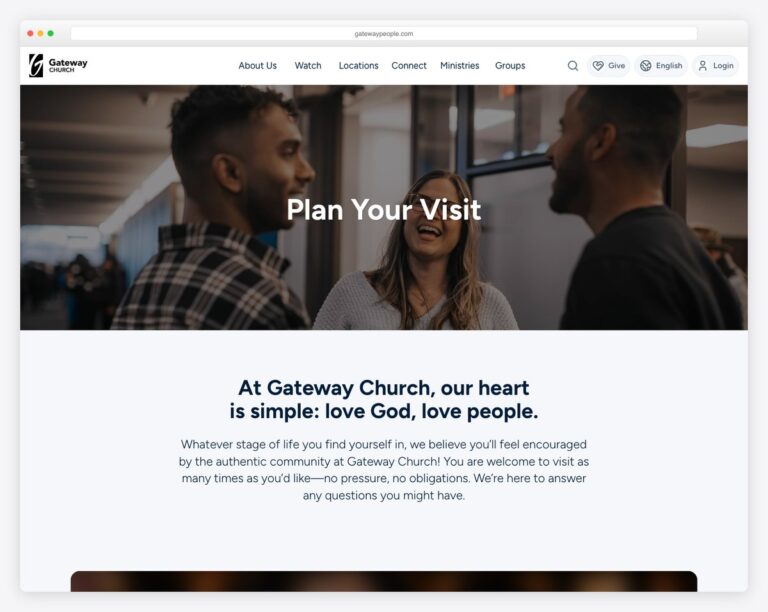
The contact page works hand in hand with your plan your visit page — send first-timers there for service details — and both belong on your list of essential church website features.
info@ nobody checks. Messages — including prayer requests and first-time-visitor questions — pile up unread. Route to a named, responsible person.If you have more than one location, your contact page needs a campus selector so a message reaches the right campus team — and each campus should have its own address, phone, and map (ideally its own page) rather than a single shared inbox. This isn’t just good service; it’s good local SEO, because each campus needs its own findable NAP to rank in its own town. If that’s you, our guide to multi-campus church website design covers the full picture. And whatever your size, build the form for accessibility: real, visible field labels (not placeholder-only), large tap targets, and keyboard navigation so everyone can reach you.
📄 Free download: The Church Contact Page Checklist (PDF) — every must-have, the smart-form fields, the prayer/emergency path, and a copy-paste schema block on one page.
A great church contact page does three jobs at once: it reassures a nervous first-time visitor that real people are easy to reach, it routes every message — especially prayer and pastoral needs — to the right hands, and it tells Google where to find you. Show your address and map, keep the form short with a routing dropdown, treat prayer and emergencies seriously, add the schema, and promise a response time. It’s a small page that quietly does a lot of ministry. Run it past our full church website checklist before you publish.
Your full name and address, an embedded map with directions, a tap-to-call phone number, a real monitored email, service times, office hours, a short contact form with a routing dropdown, staff or department contacts, a prayer-request option, a pastoral-emergency phone line, links to active social accounts, and local-SEO schema with your NAP. Keep it mobile-first.
Both. Always show your address, phone, and email directly on the page — a form alone frustrates visitors and hurts local SEO. Then add a short form with a routing dropdown for people who’d rather type than call. The form complements your contact info; it shouldn’t replace it.
Offer a clear prayer-request option — a dedicated form or a routing choice — with a privacy selection (confidential, share with the prayer team, or share publicly) and a name field. Most important, assign someone to read and respond within a day or two. Also include a separate “in a pastoral emergency, call this number” line for urgent needs.
Adding structured-data (JSON-LD) schema with your church’s name, address, phone, and hours helps Google understand and display your location in local and map results. The key is consistency: your name, address, and phone must match exactly across your contact page, footer, and Google Business Profile.
Short — ideally name, email, and message, plus one routing dropdown. The longer a form gets, the fewer people complete it. Capture only what you truly need to respond, and gather more detail in the follow-up conversation rather than upfront.

Church Website Features
Church Website Features
Church Website Features
10 complete church website templates, MIT licensed. Browse every demo freely; we will email you whichever folder you want.
All templates